Wakey Care
2021 — Ongoing
Wakey Care
2021 — Ongoing
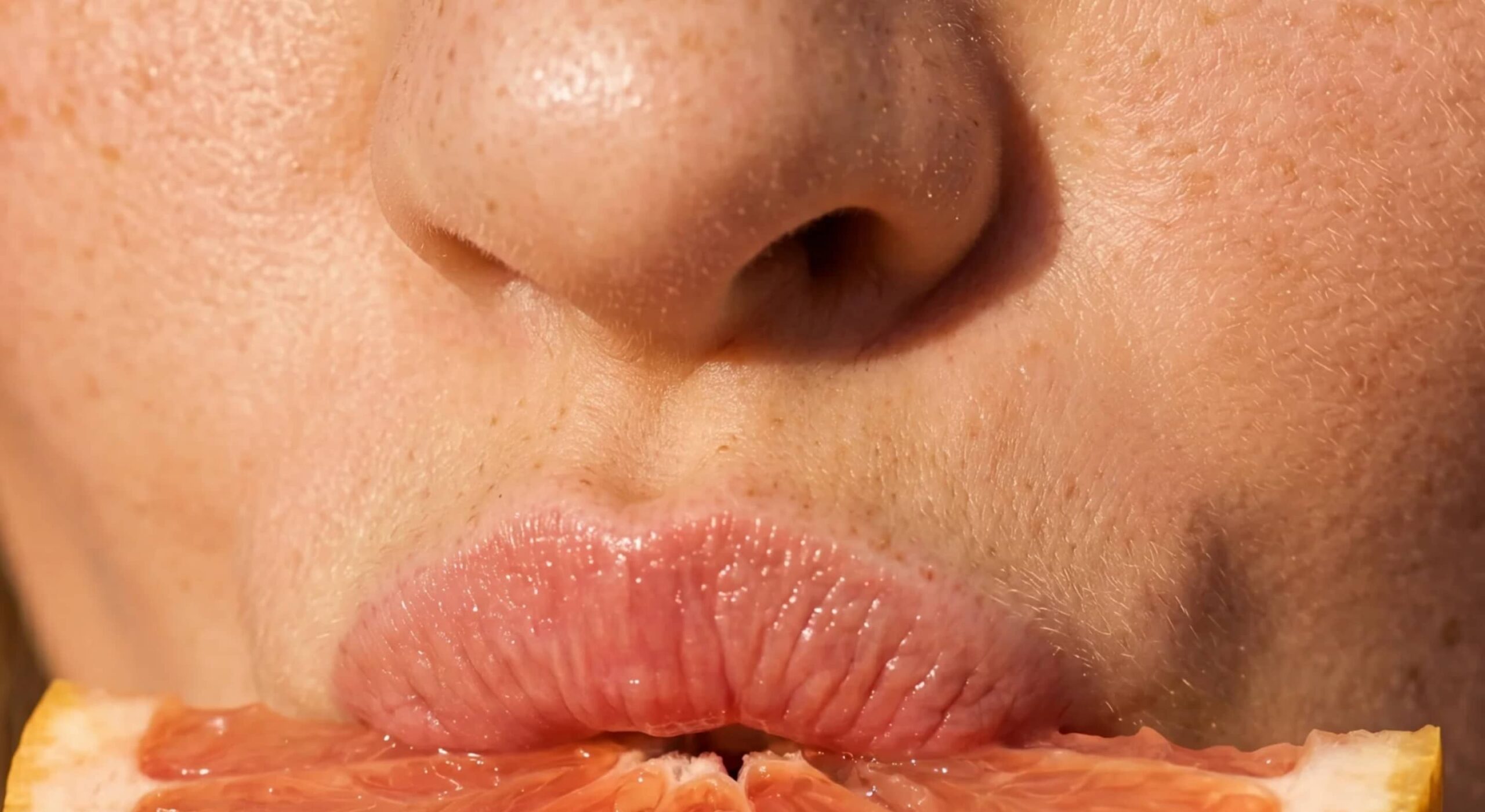
Wakey represents a rising revolution that seeks to make the world a better place, one morning at a time.
ROLE & SERVICES
Art Direction
Branding
Illustration
Packaging
Copywriting
CREDITS
Web:
askphill.com
CLIENT
www.wakey.care
APPROACH
A new movement for a new generation, uplifting, fun, bright and superclean. We aimed for a visual style that is quirky and unique yet commercial and slick.
GRAPHICAL LANGUAGE
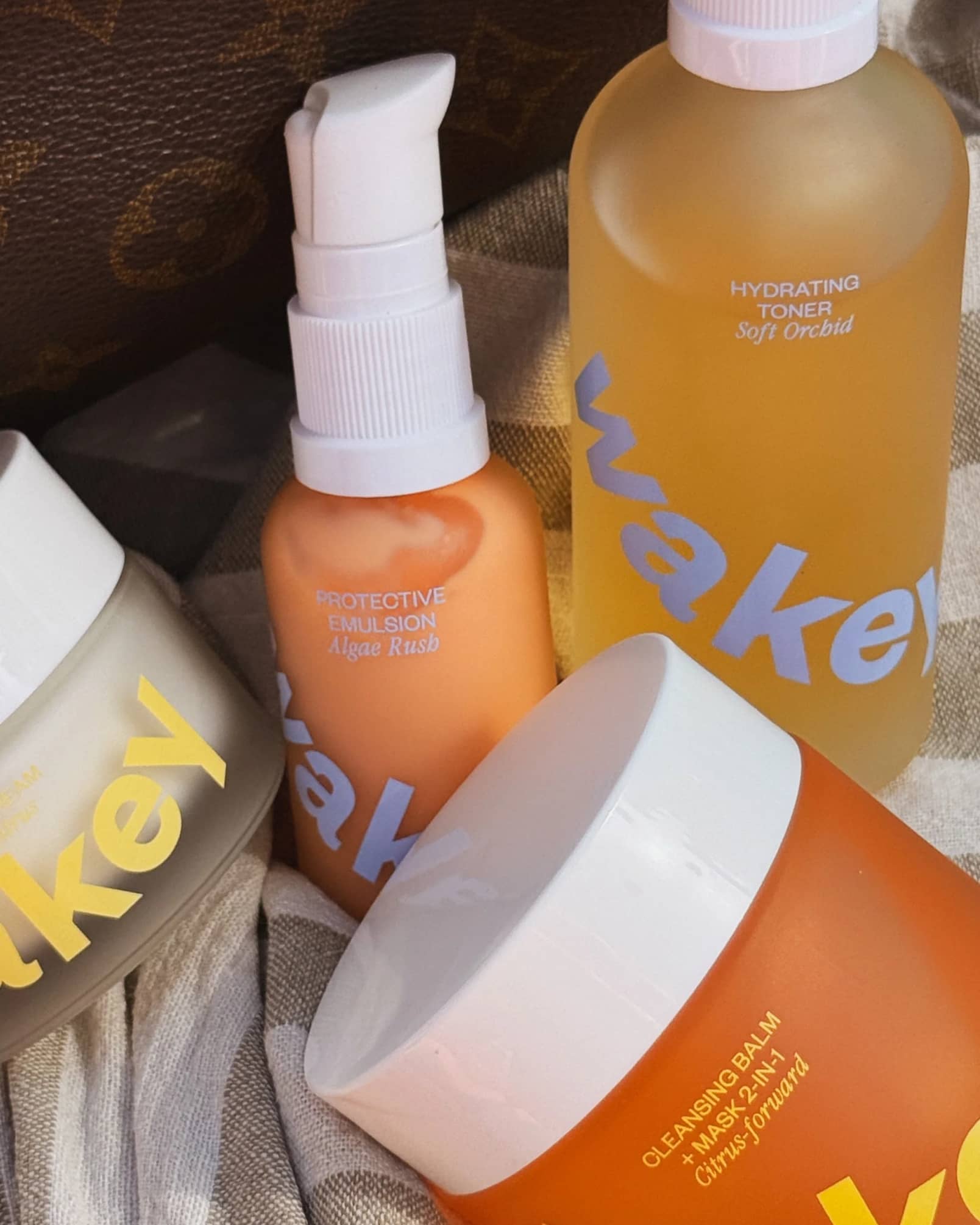
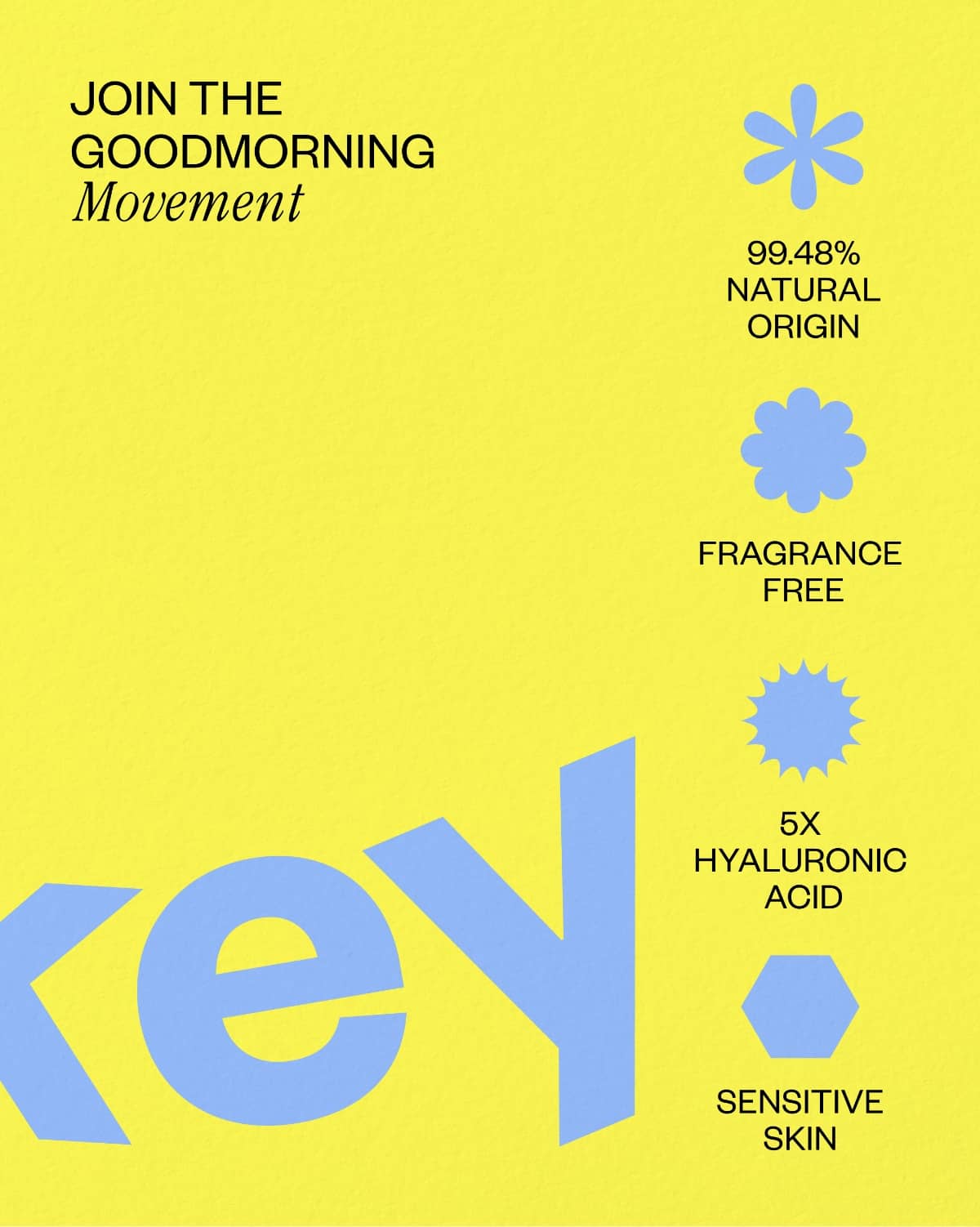
We created playful and no-nonsense shapes and graphic elements which spark joy and promote recognizability in any composition.
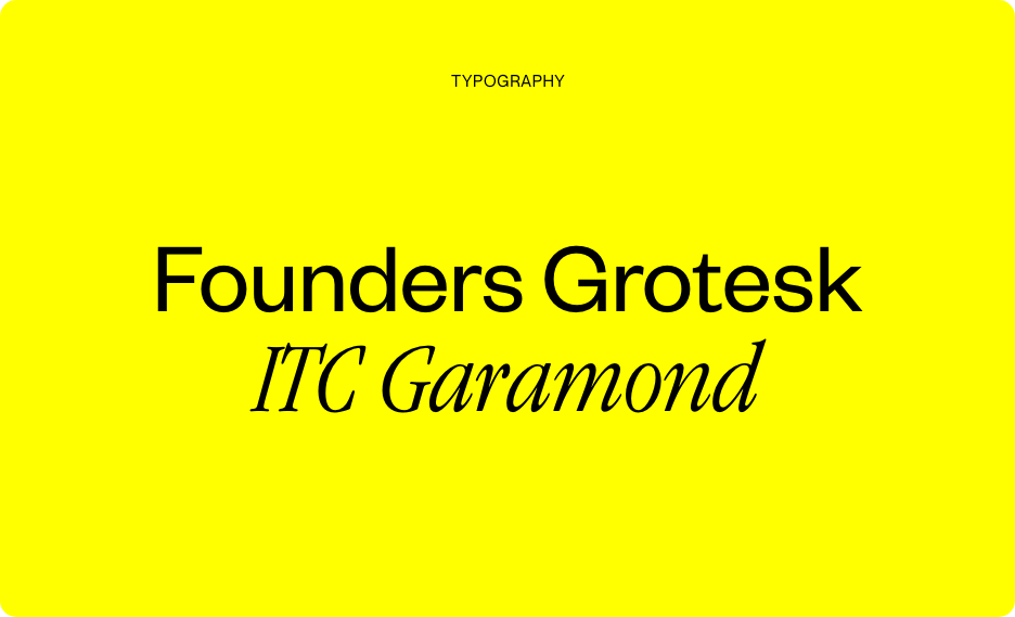
TYPOGRAPHY
Within the graphic language we opted for Founders Grotesk and ITC Garamond. Two contrasting typefaces that complement each other. Symbolizing the clean and straightforward character of Wakey’s products, while leaving room for its playful side.
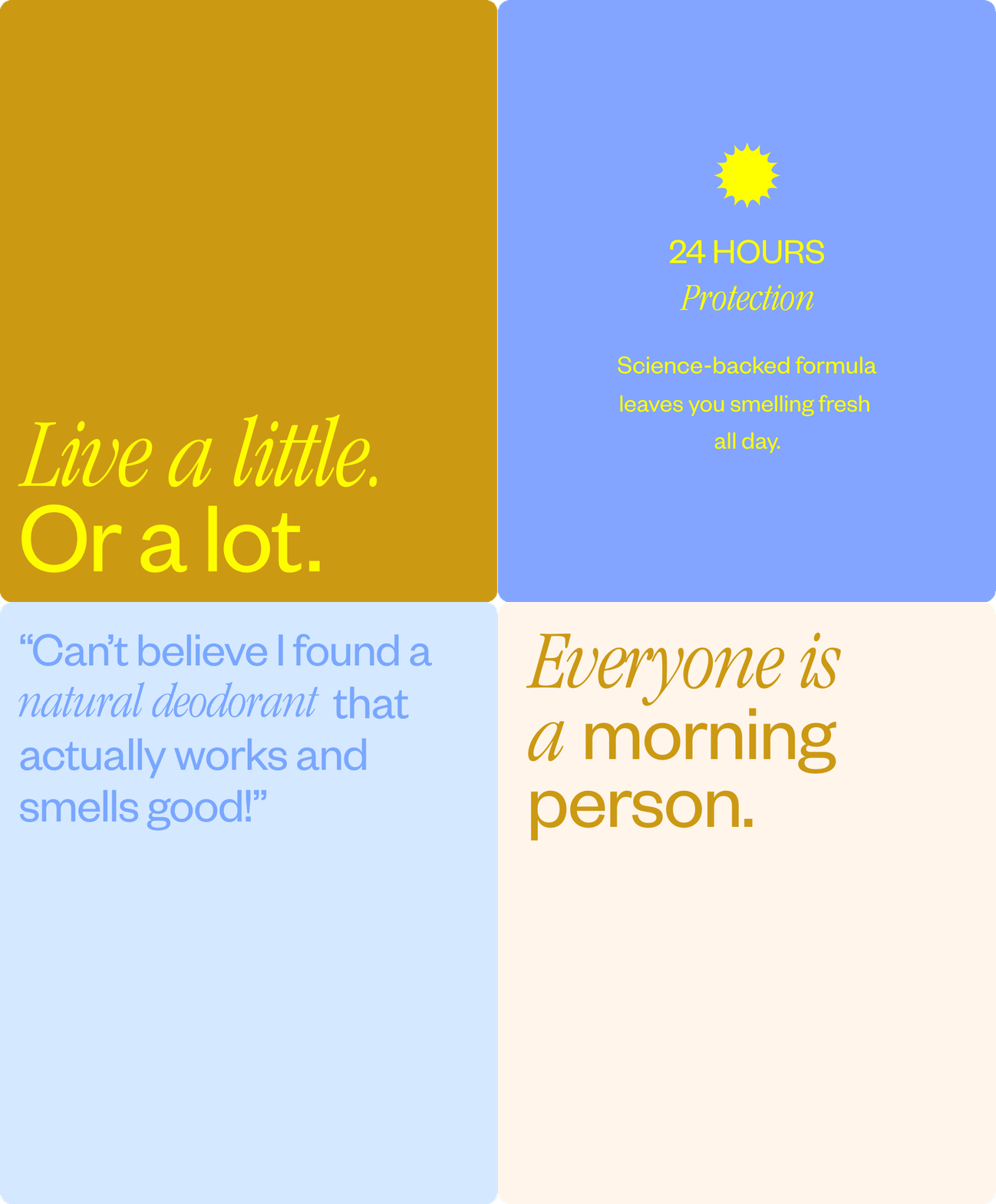
A smile-inspired logo that brings a smile to your face.
Dynamic, energetic and spirited.
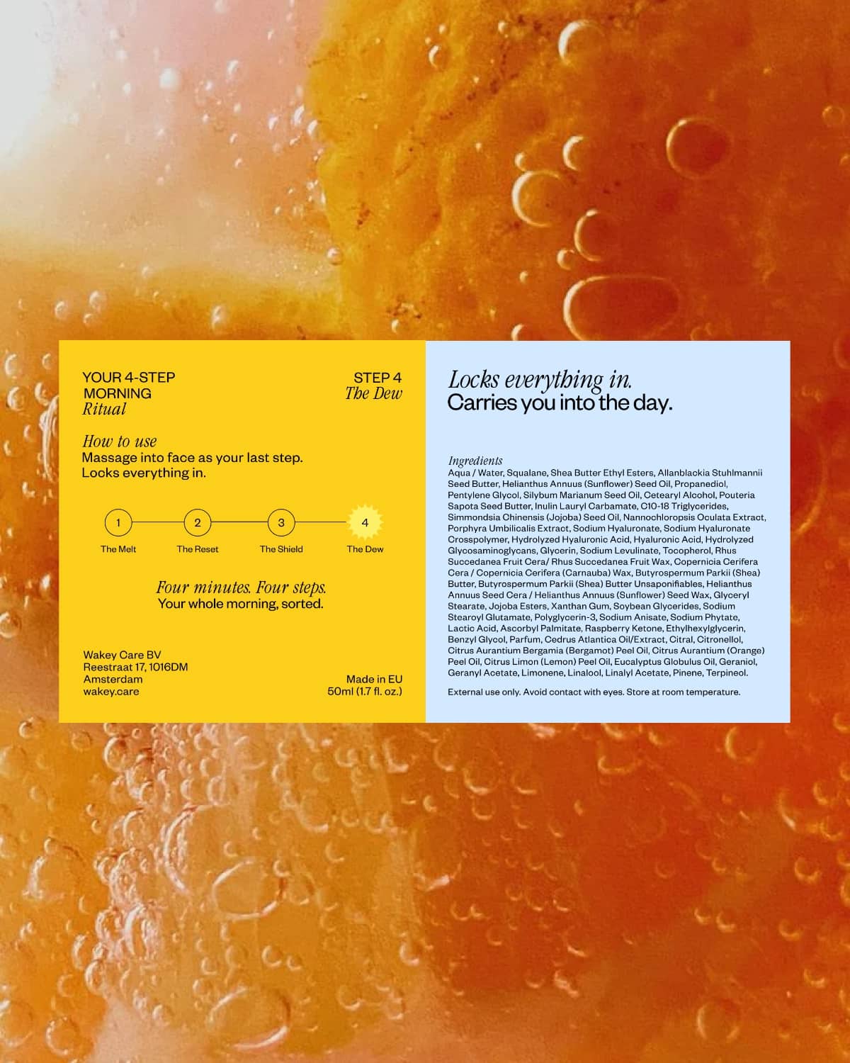
COLOUR PALETTE
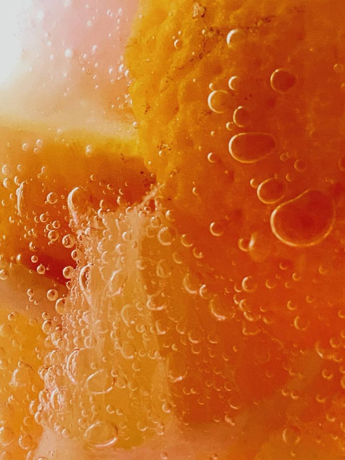
The colour palette brightens not only your morning but every part of your day with its sunrise colours. Bold, crispy and bright, it communicates Wakey’s uplifting spirit.
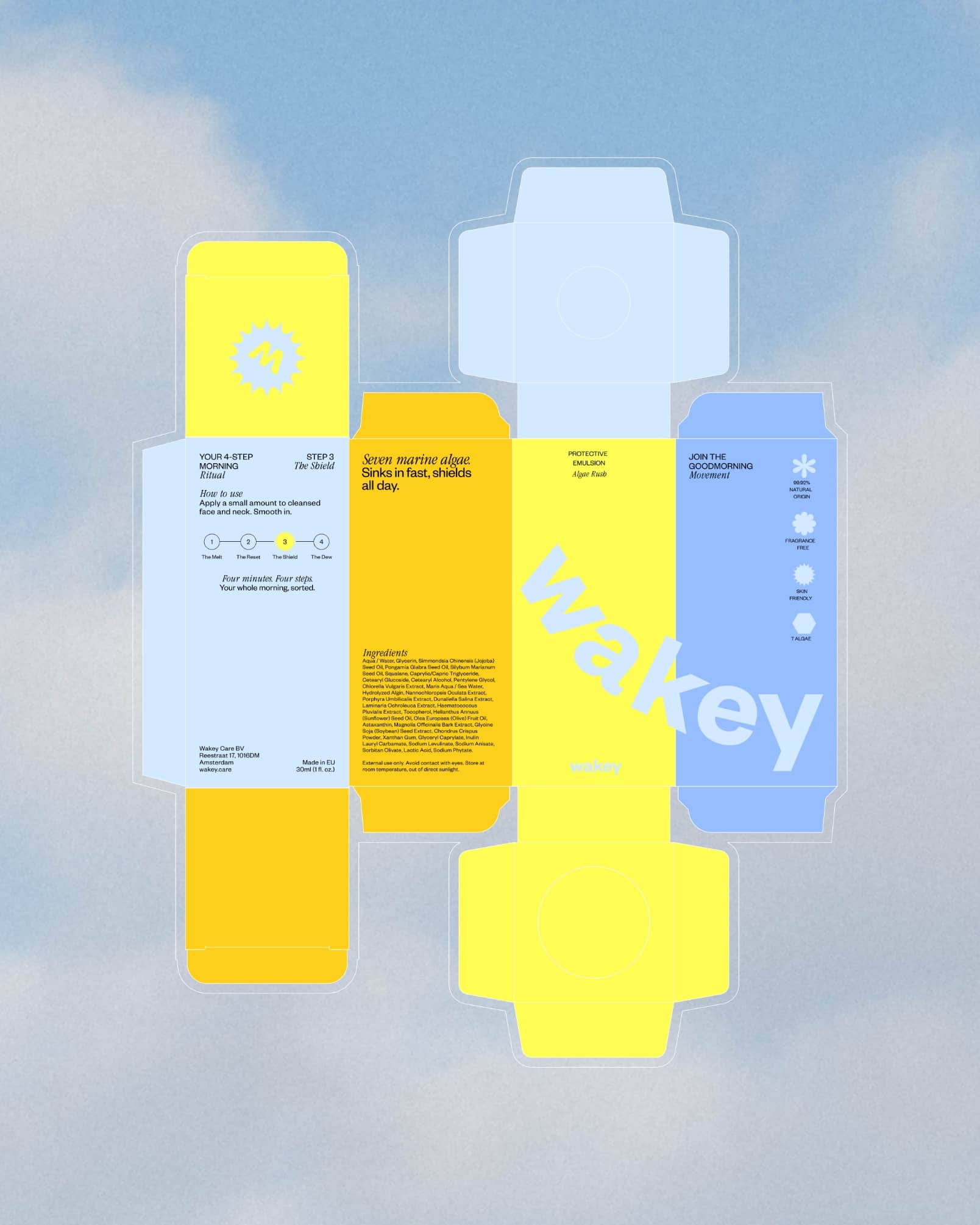
THE GOOD MORNING MOVEMENT
Everyone has a morning routine. But what our regular creams, soaps, and sprays often fail to mention are the harmful effects they can have on people and the planet. With a revolutionary range of morning products, Wakey offers quality, honesty and ‘a way to do better’.
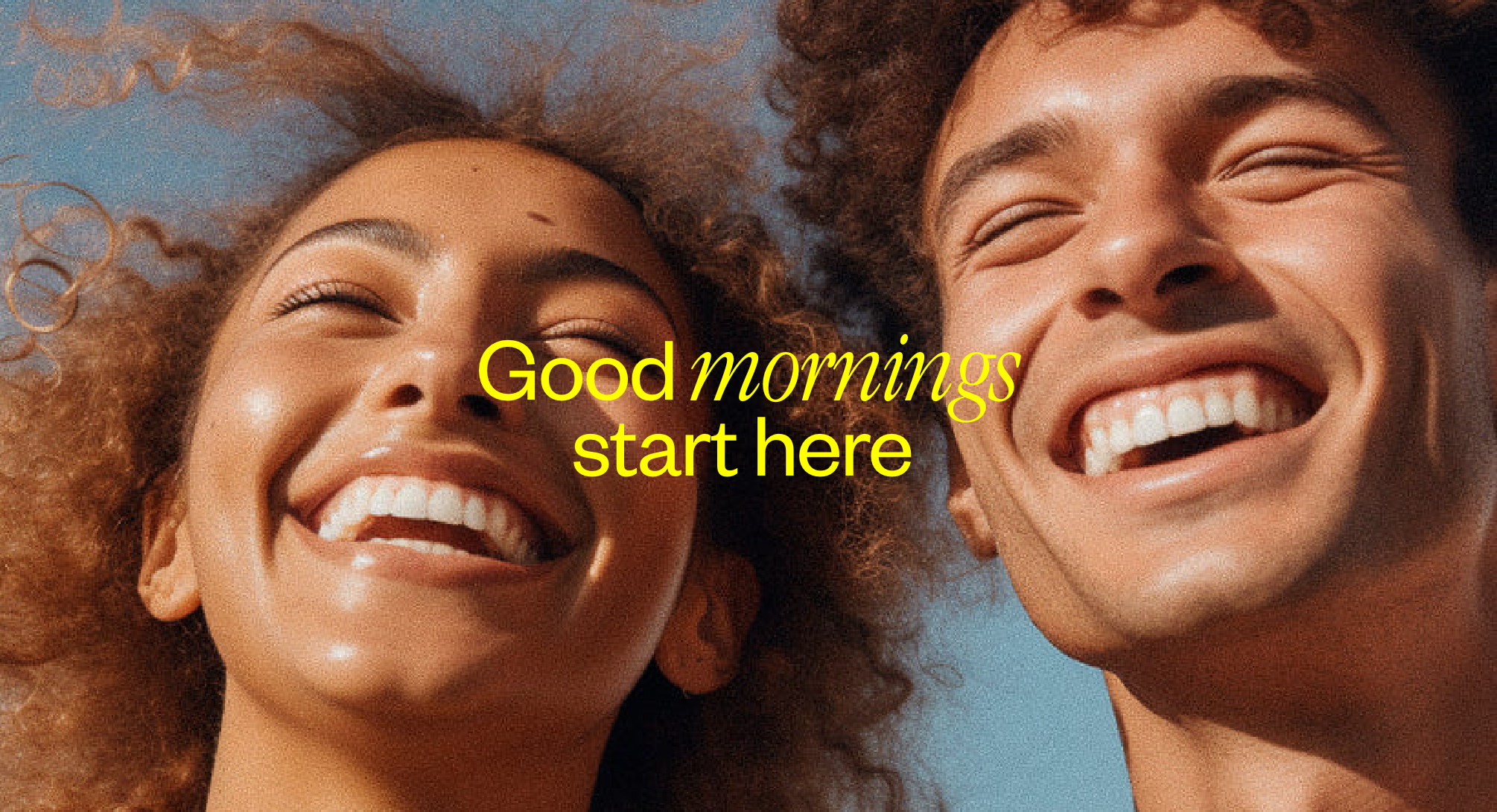
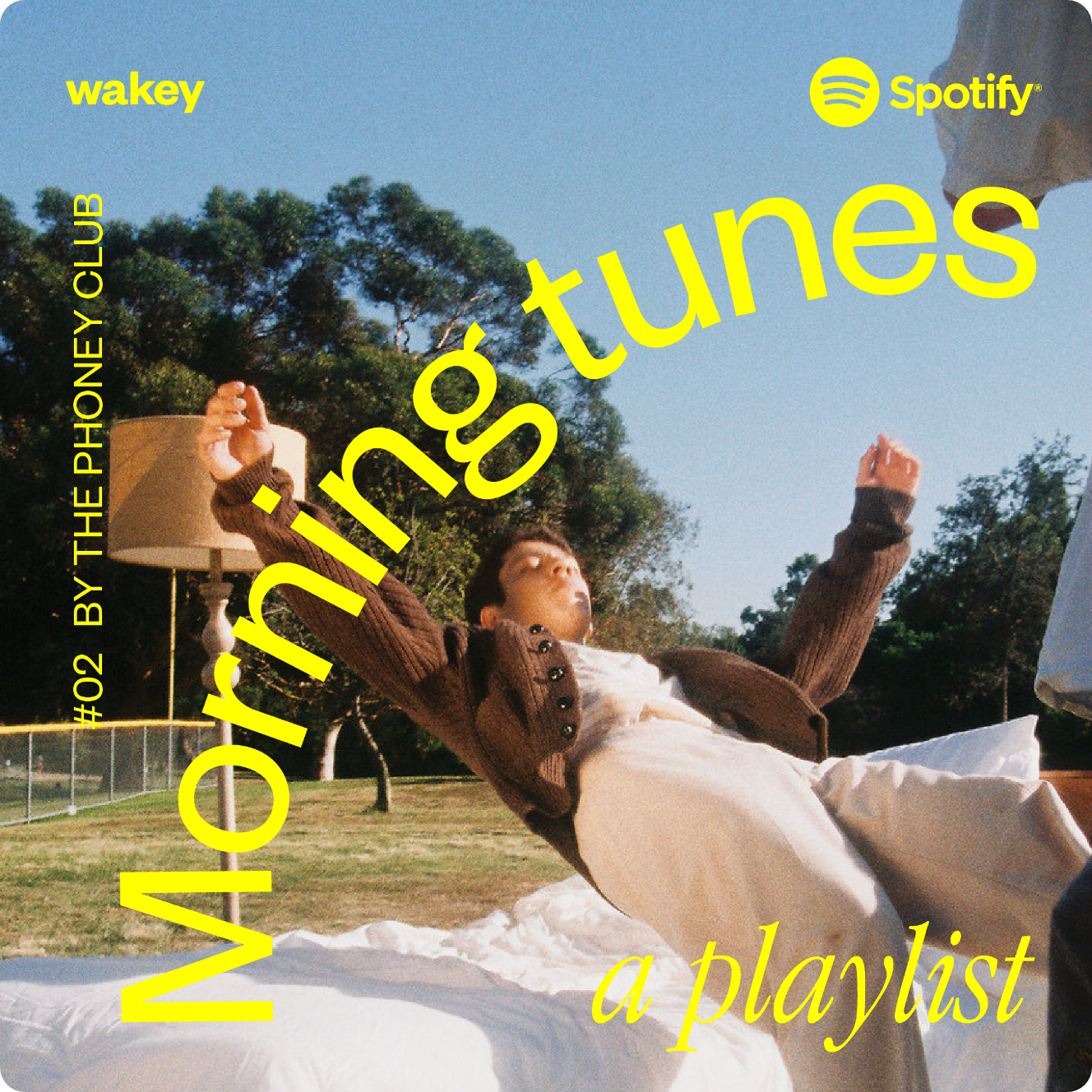
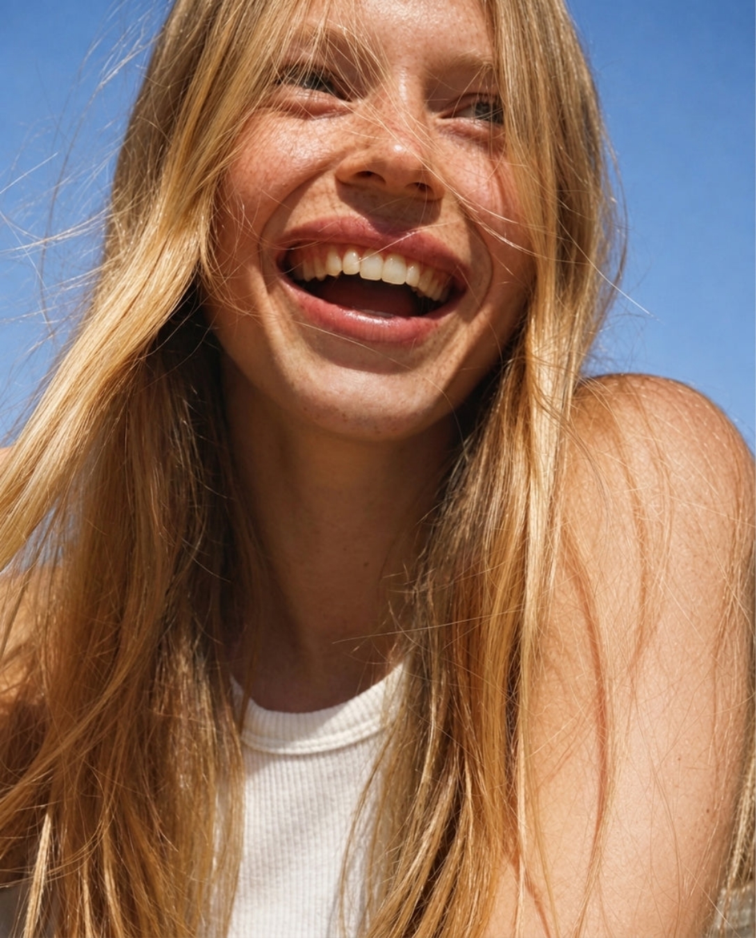
We centered Wakey around the idea of revolutionizing mornings and created a community with our Wakey Manifesto, a Morning tunes playlist and social campaign with genuine morning faces.
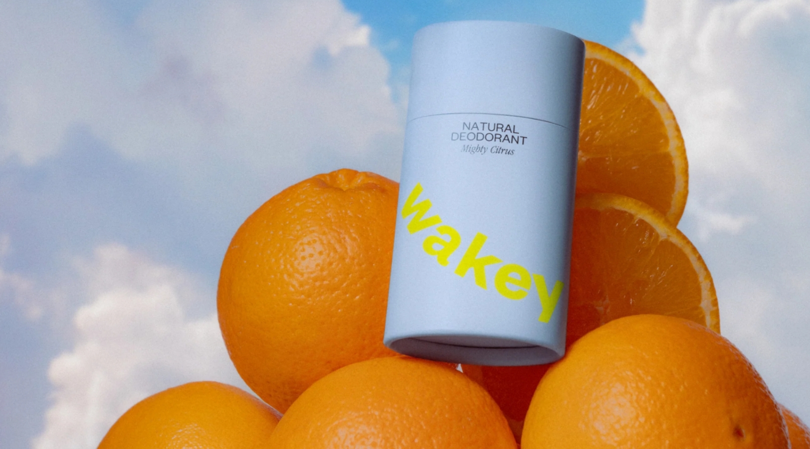
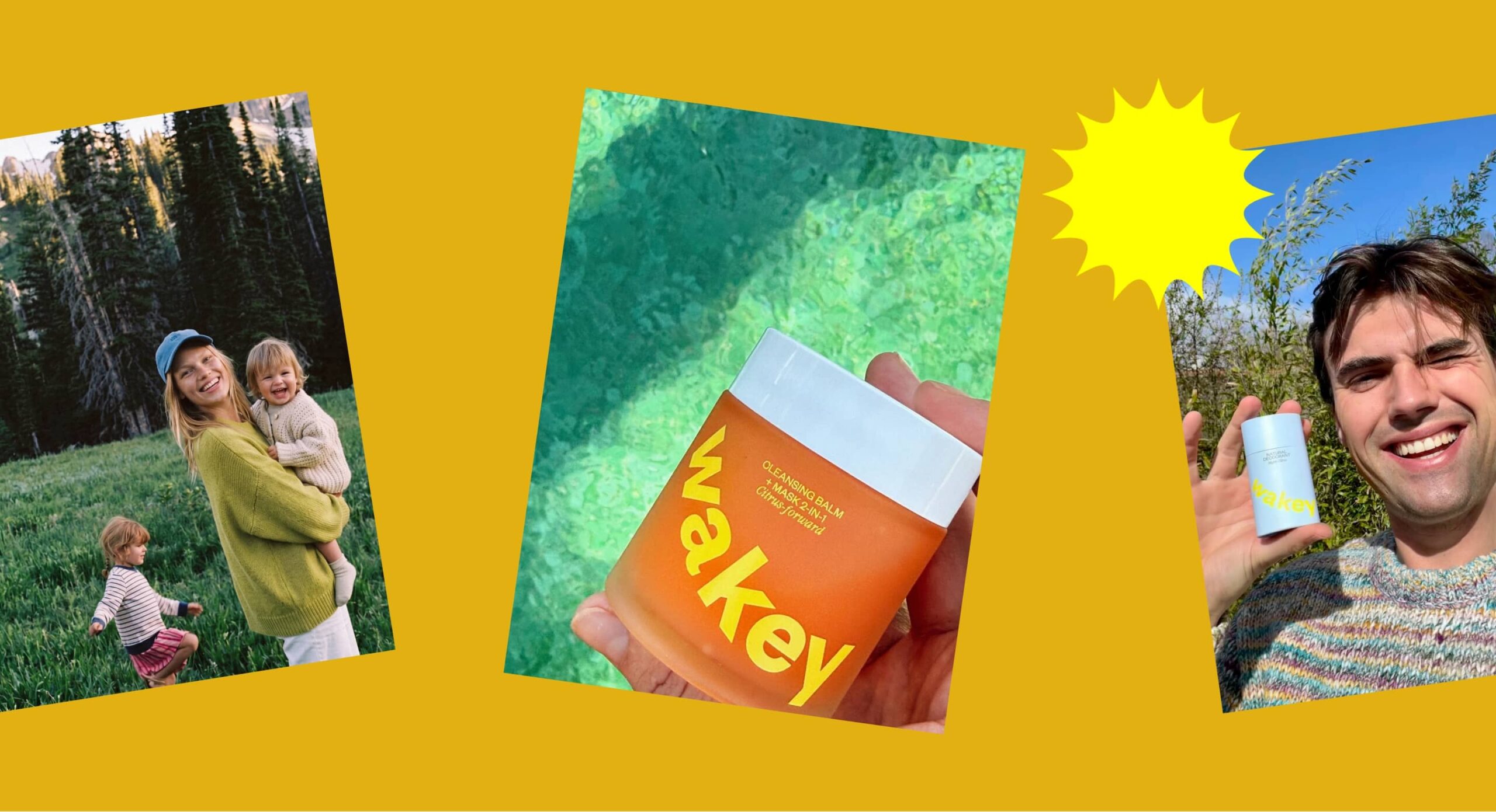
“The outcome is awesome and the road to it was super smooth.”
PAUL VEEN
Co-founder Wakey
Ever wondered what dreams look like?
Connect with us
Explore More
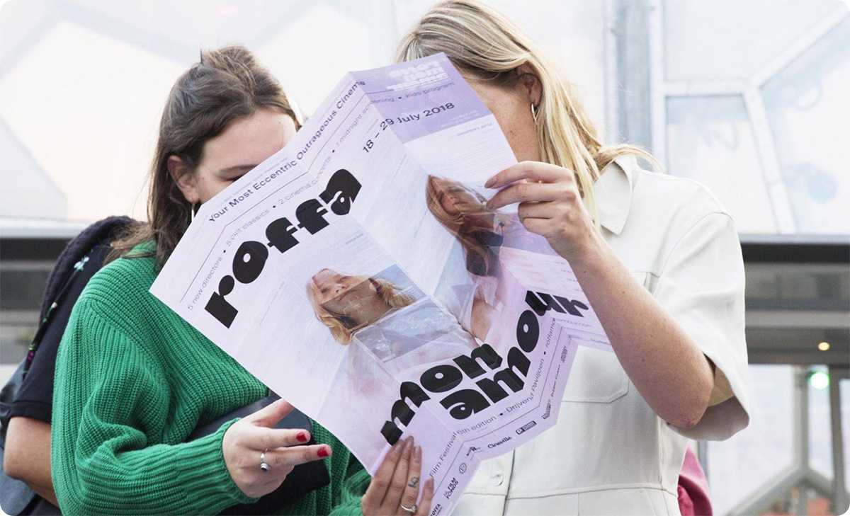
An affair to remember, Phoney x Roffa Mon Amour
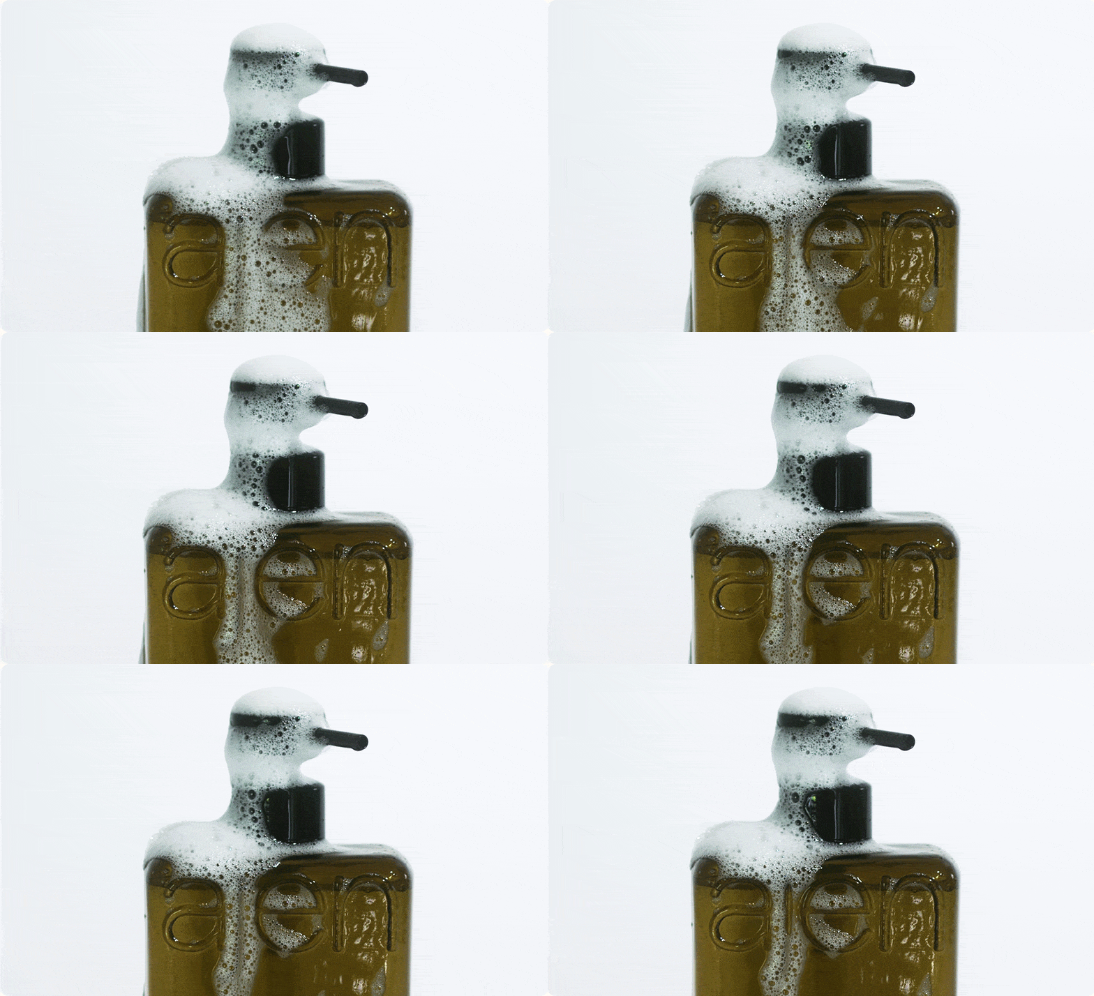
Bringing local Dutch nature into your home with Ajen Botanical Body Care