CÎME Skincare
2025
CÎME Skincare
2025
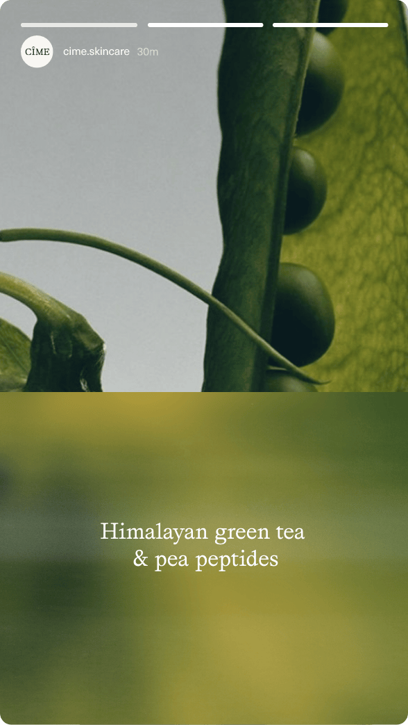
By blending cutting-edge skin technology and ancient Himalayan wisdom, CÎME has developed profound formulas that both promote skin health and elevate its natural beauty.
ROLE & SERVICES
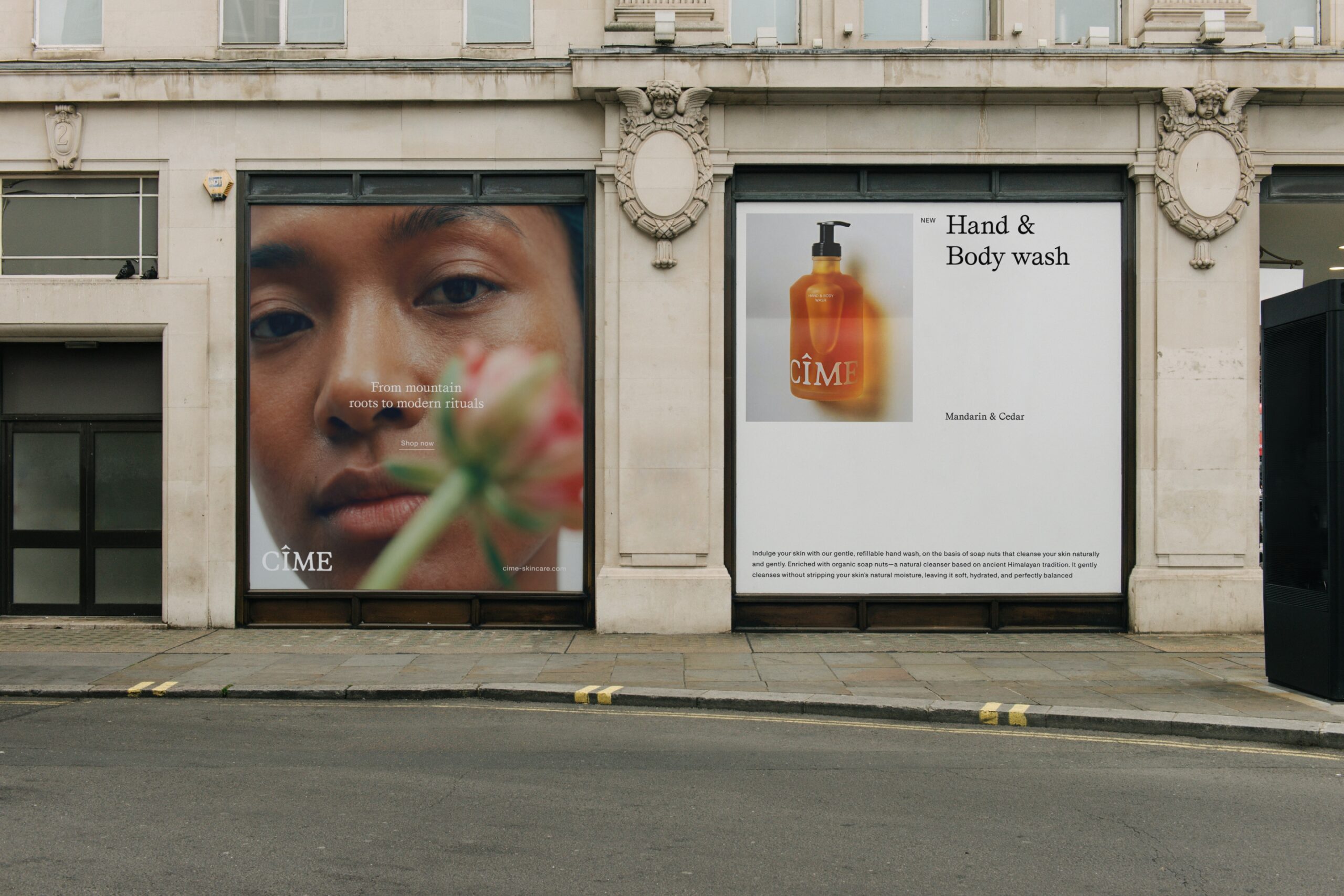
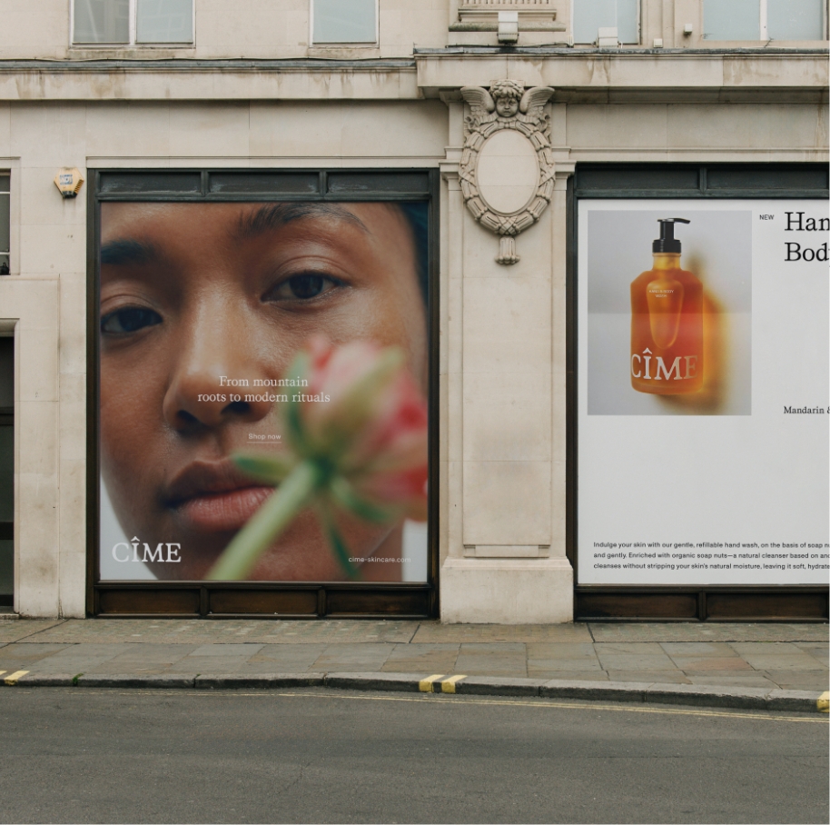
Branding
Campaigns
Graphic Design
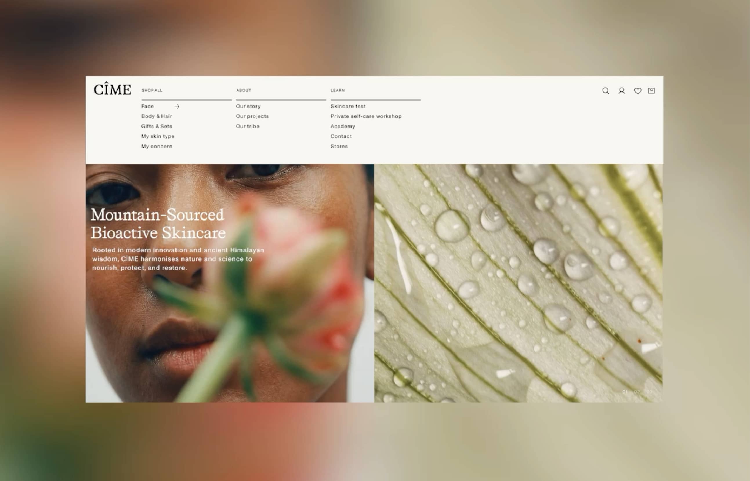
Web Design
Packaging
CREDITS
Webdesign:
deardigital
Photography:
The Phoney Edit for CÎME
CLIENT
CÎME Skincare
APPROACH
High in the valleys of the Himalayas, a woman’s face is a living testament to her journey. Laugh lines speak of joy shared in community, sun spots mark days spent tending high-altitude gardens that nourish entire villages.
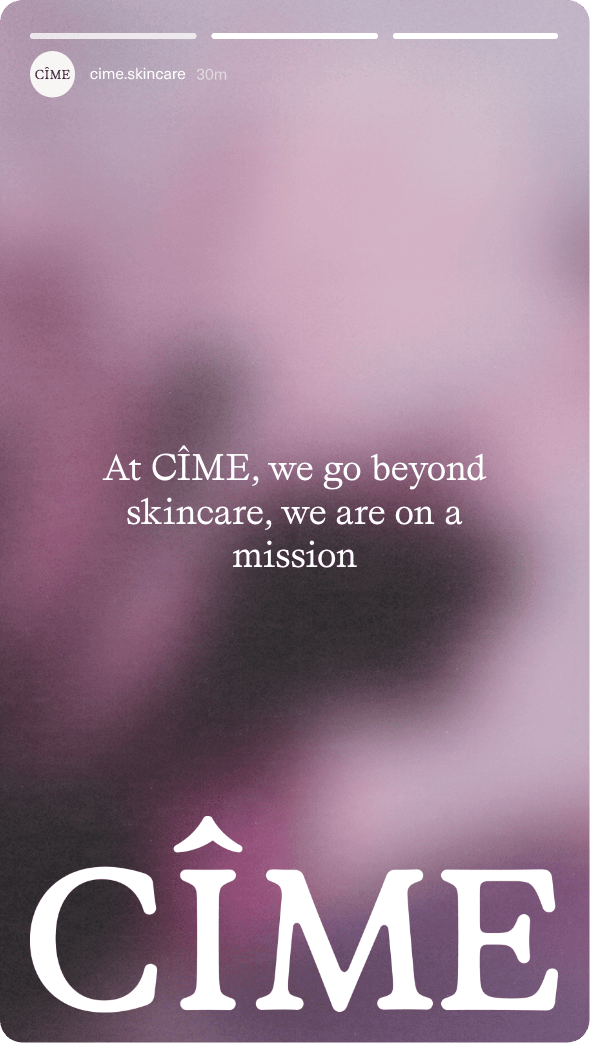
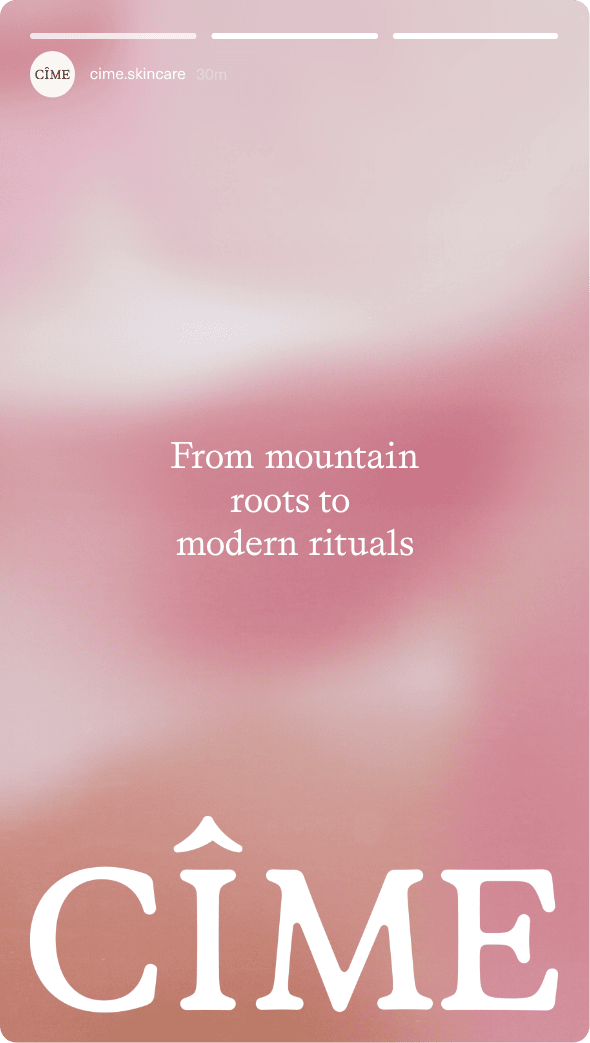
This is the soft gaze; a core philosophy at the heart of CÎME. Born from the belief that skincare can be better, CÎME is grounded in Himalayan botanical wisdom and perfected through modern science, with deep respect for women and their true essence. We upgraded the brand to mirror this philosophy, expressing the gentleness, integrity, and quiet strength with which CÎME meets the world.
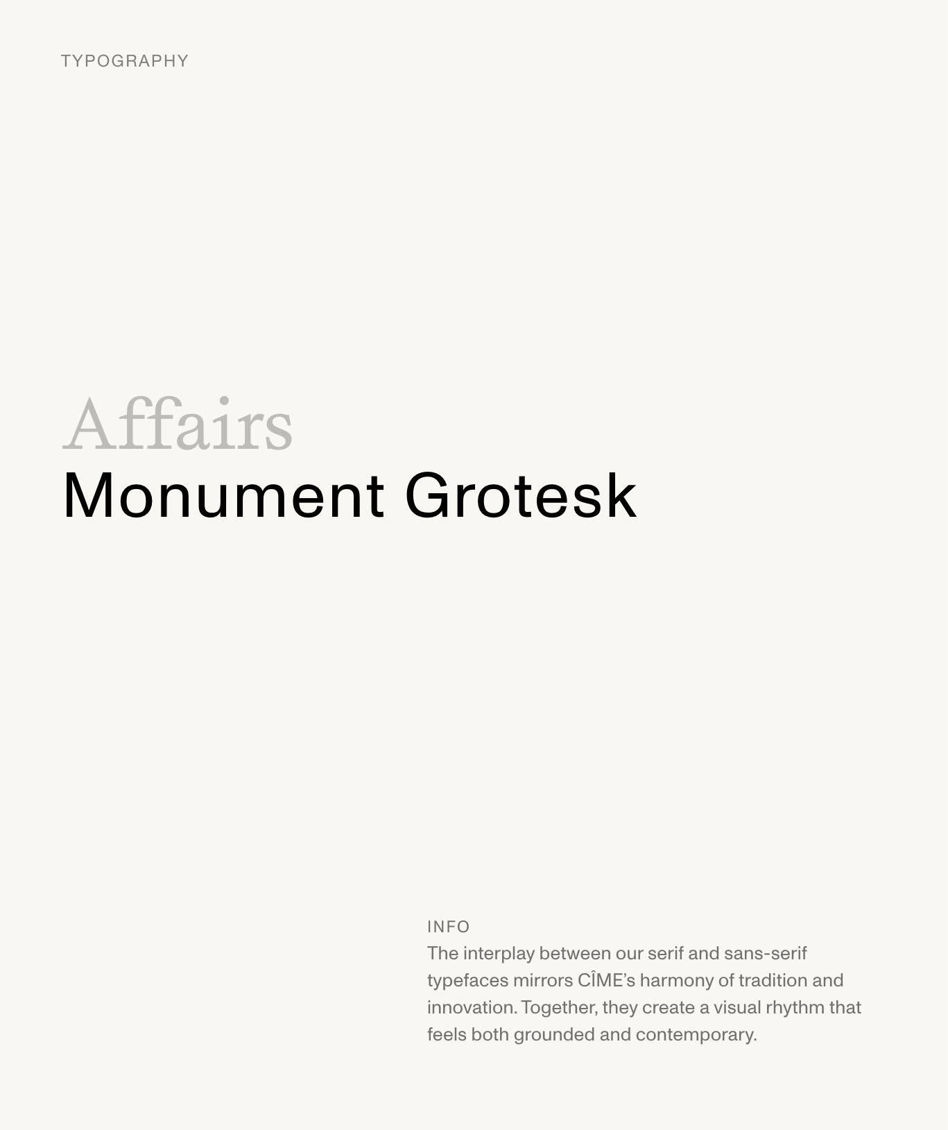
LOGO
A thoughtful update brings the logo into sharper focus. Its refined silhouette balances a premium feel with approachable warmth - a visual expression of CÎME’s ‘soft edges, strong core’ philosophy. The distinctive accent mark subtly echoes the Himalayan peaks that inspire the brand’s ingredients and heritage.
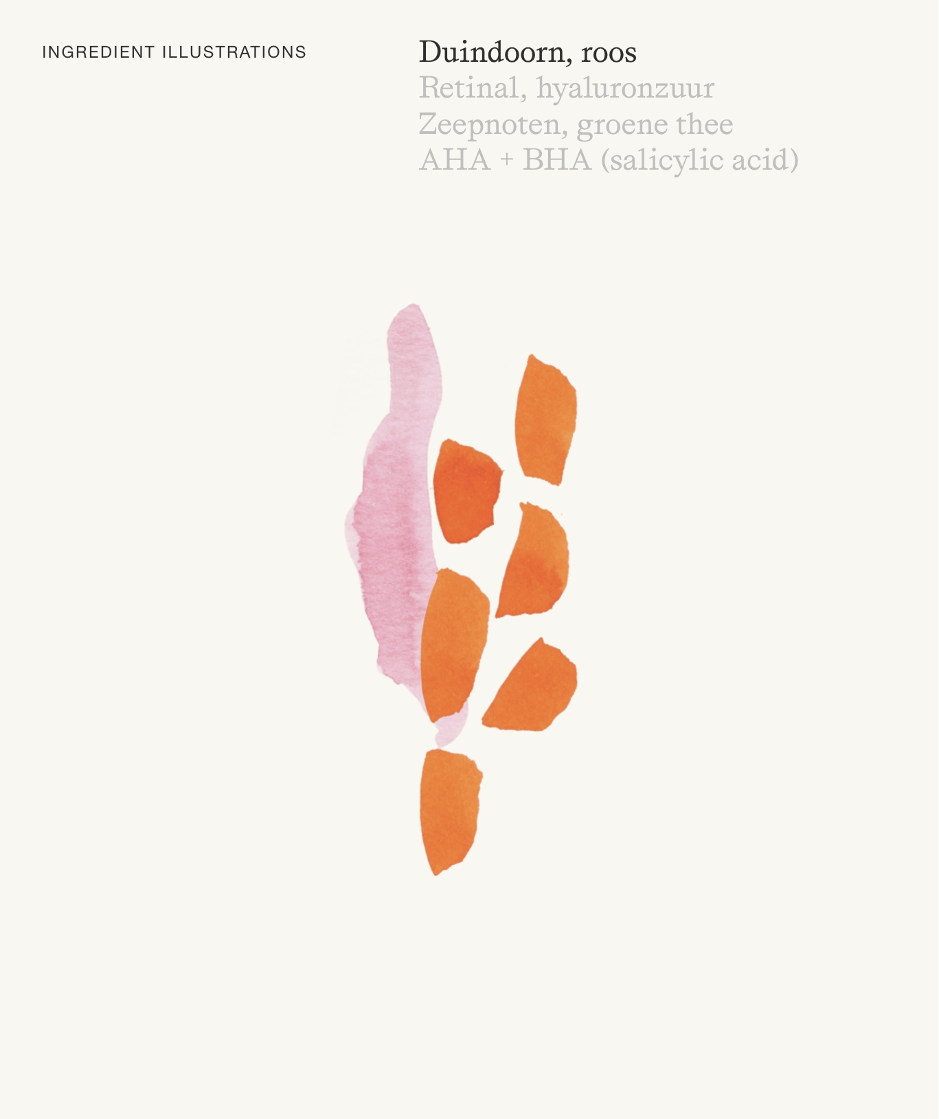
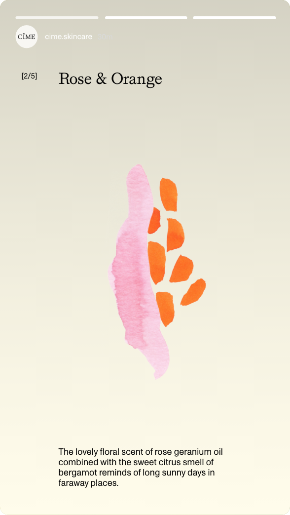
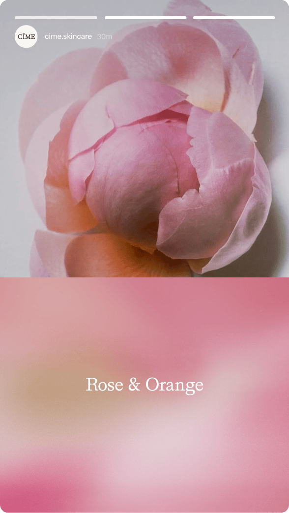
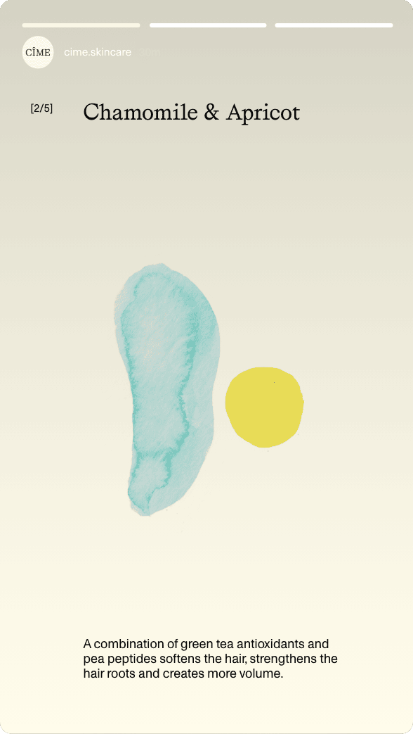
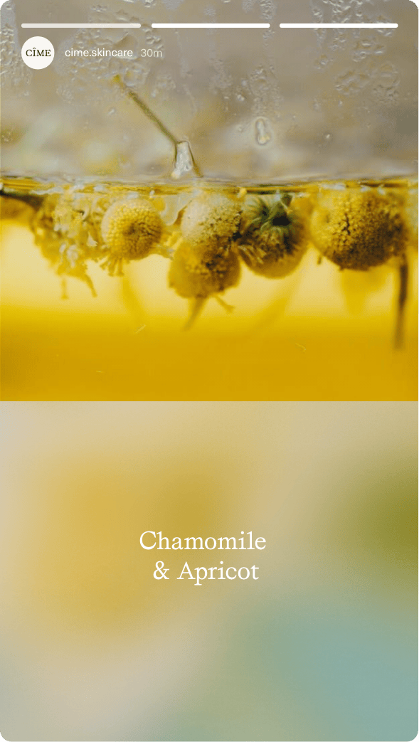
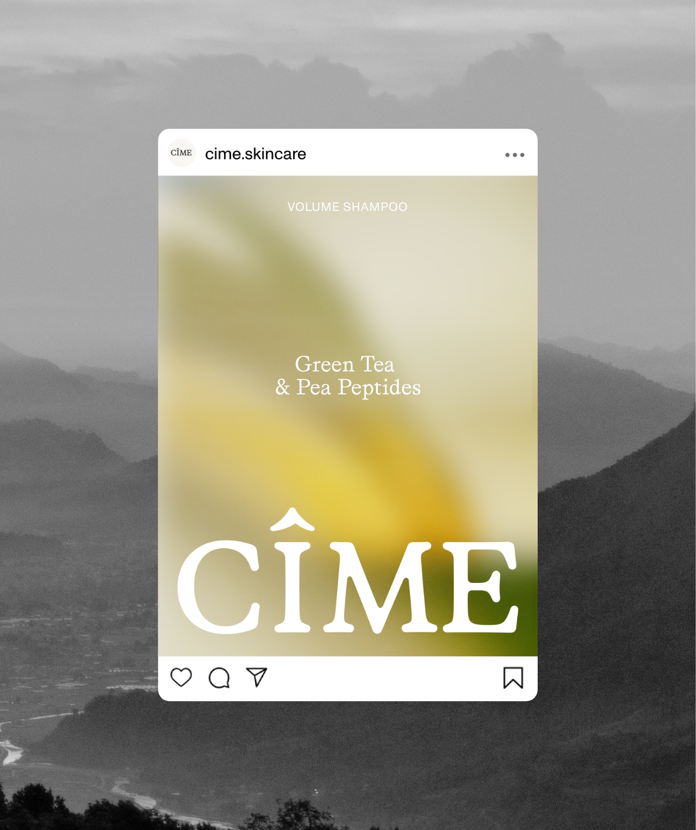
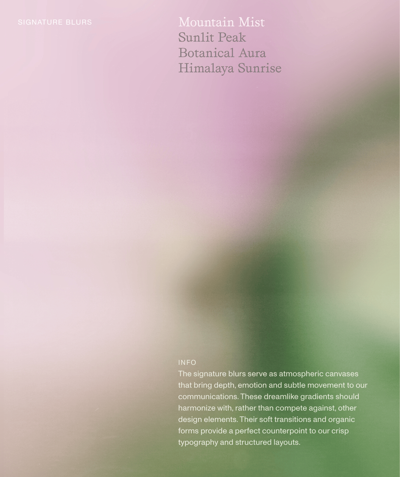
BLURS & ILLUSTRATIONS
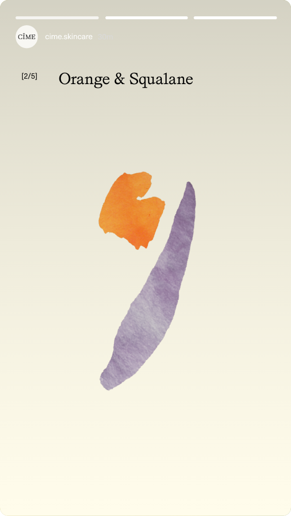
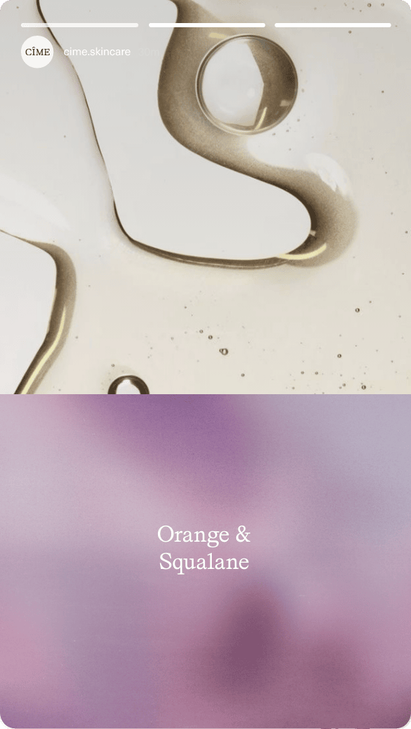
CIME's signature blurs and abstract watercolor illustratrions serve as an atmospheric canvas that brings depth, emotion, and subtle movement to its communications.
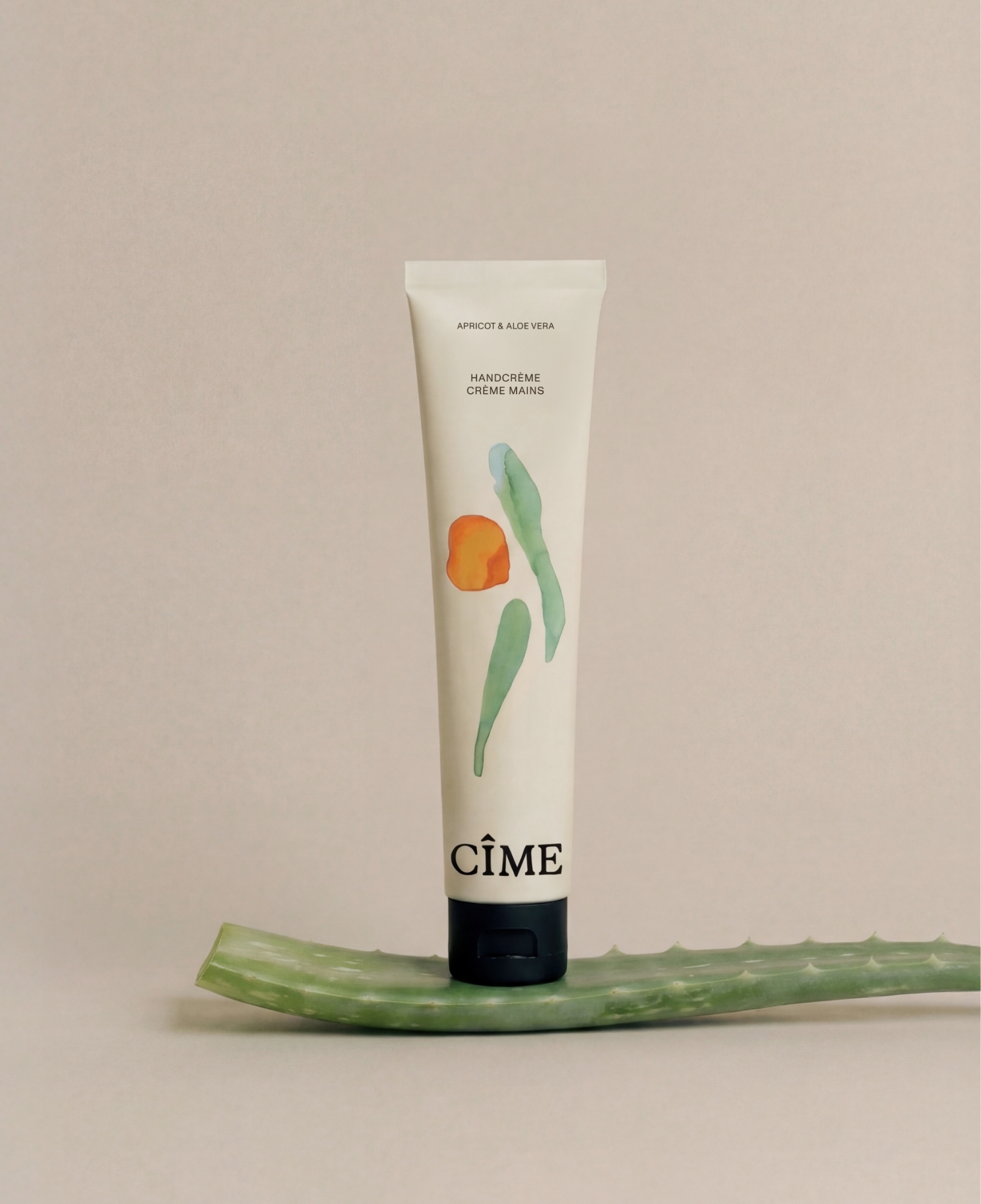
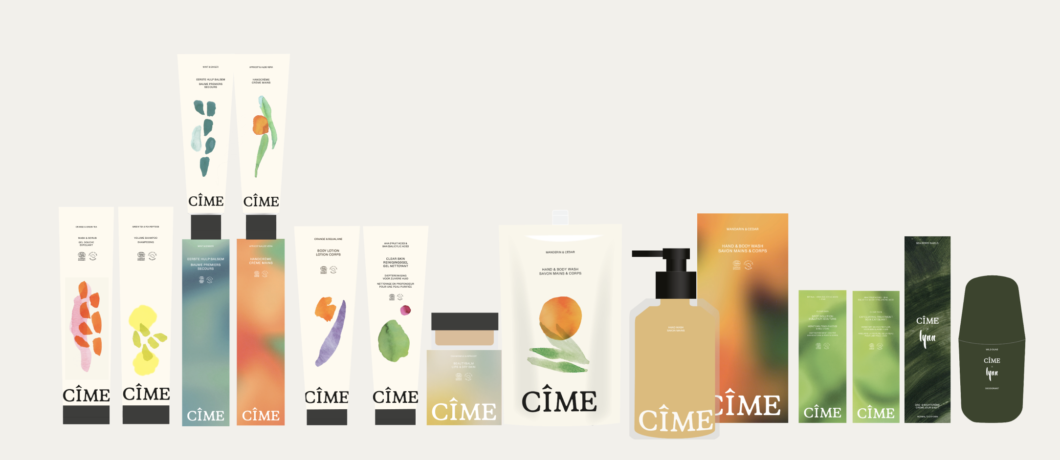
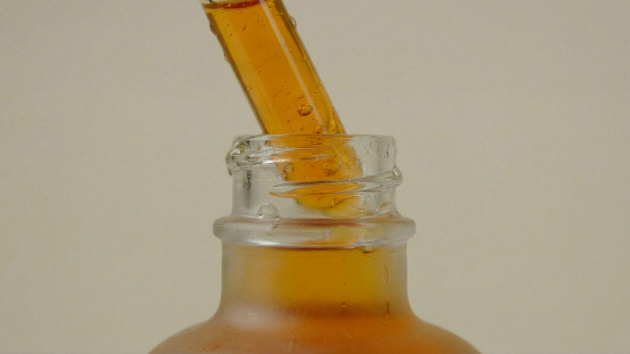
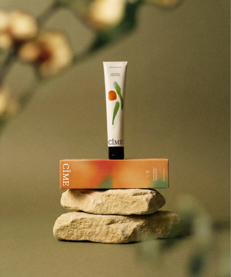
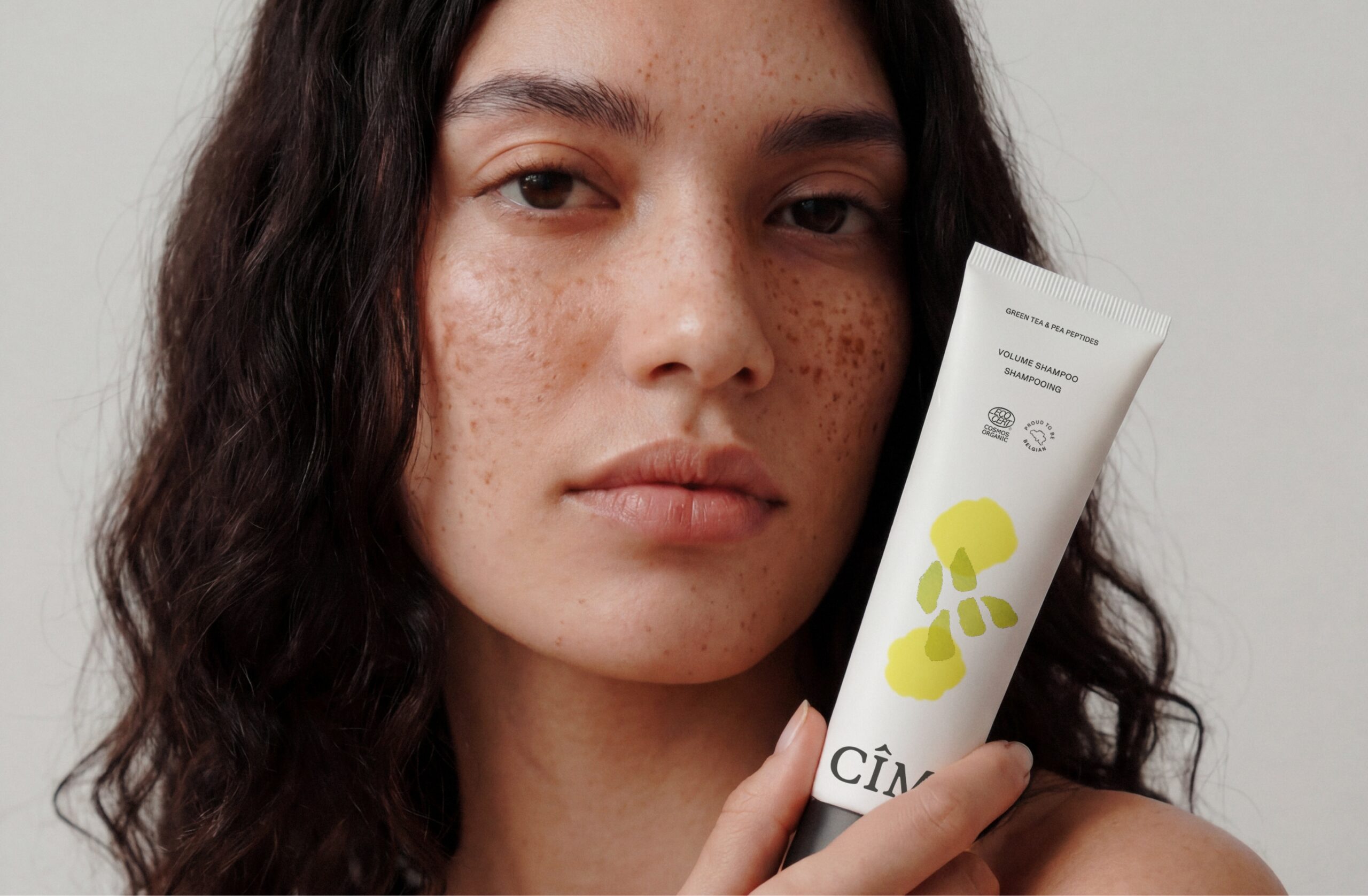
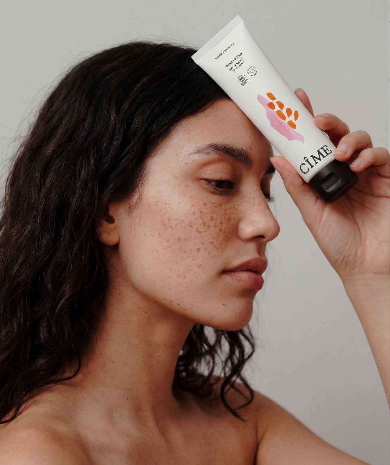
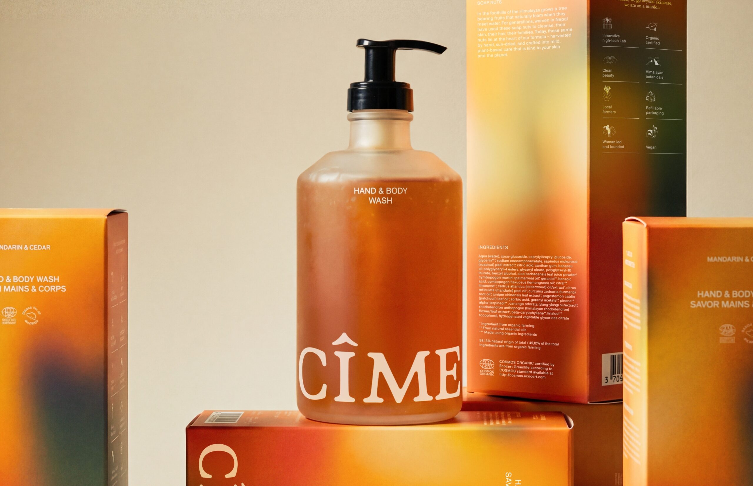
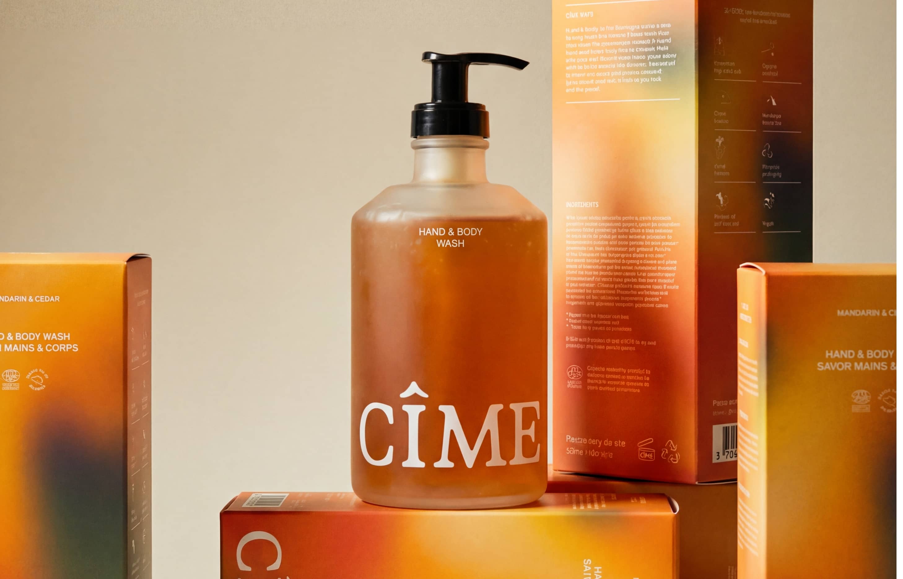
PACKAGING
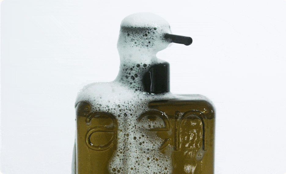
CÎME's new packaging design is where brand philosophy becomes tangible. The blur finds its place on the outer packaging, while the signature watercolour illustrations adorn the bottles and tubes within. A new signature bottle is introduced for CÎME's hand soap, executed in frosted glass that provides a high-end tactile experience. It's the same warm, approachable CÎME, in an elevated form.
"We are absolutely thrilled with the rebranding work The Phoney Club delivered for CÎME, covering our branding, website and packaging. The results exceeded our expectations, and we are incredibly happy with our new look. TPC had a fantastic ability to gently encourage us to explore bolder options, pushing us gently beyond our initial 'safe' choices, which led to a truly remarkable outcome. The TPC team is a pleasure to work with, we highly recommend them!"
ISABEL COPPENS
– Founder CÎME
Every present needs a future. Let's reinvent reality together. Drop us a line
Explore More
Bringing local Dutch nature into your home with Ajen Botanical Body Care
Honoring the past while embracing the future for department store Van Tilburg