
Fest Amsterdam
2022
Fest Amsterdam
2022
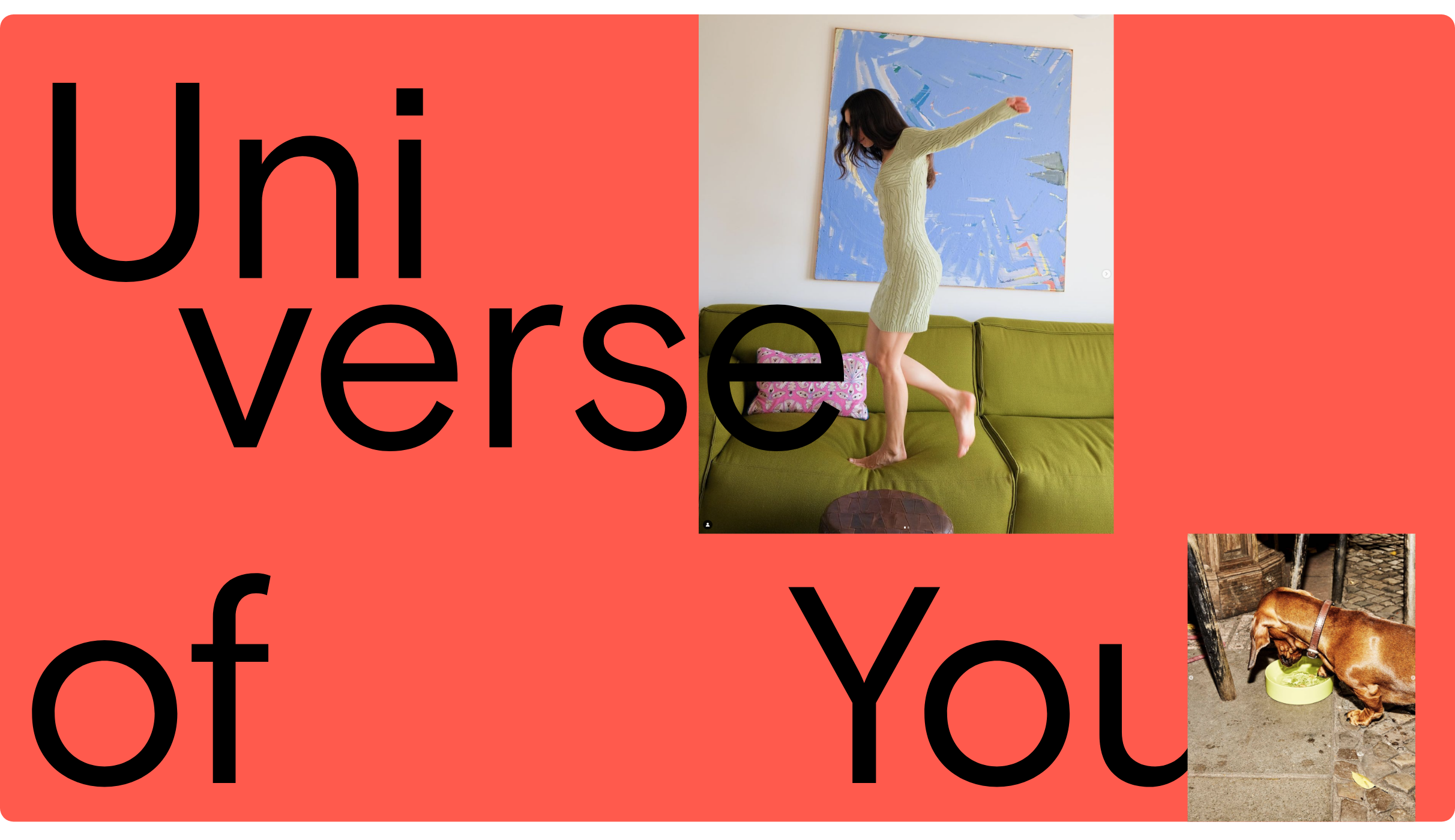
Your interior is a space for self-expression, a kaleidoscopic range of moods, colors, designs, and ideas which shape your own world. A Universe of You.
ROLE & SERVICES
Branding
Campaigns
Graphic Design
Web Design
CREDITS
Photography:
Sasha Esmail
Kasia Gatkwoska
Marie Wanders
Michèle Margot
CLIENT
www.festamsterdam.com
APPROACH
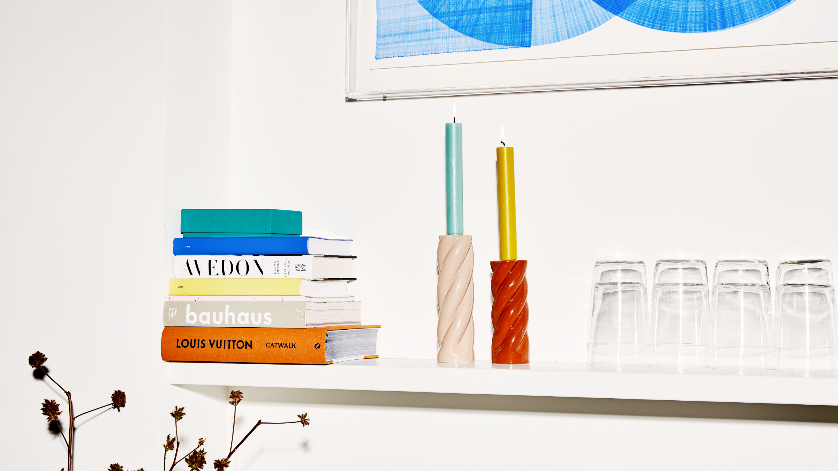
Interior brand FEST represents an all encompassing effort to bring joy to everyday life and to celebrate the world around us. With its colorful character, the brand advocates bravery and boldness in both life and aesthetics.
TYPOGRAPHY
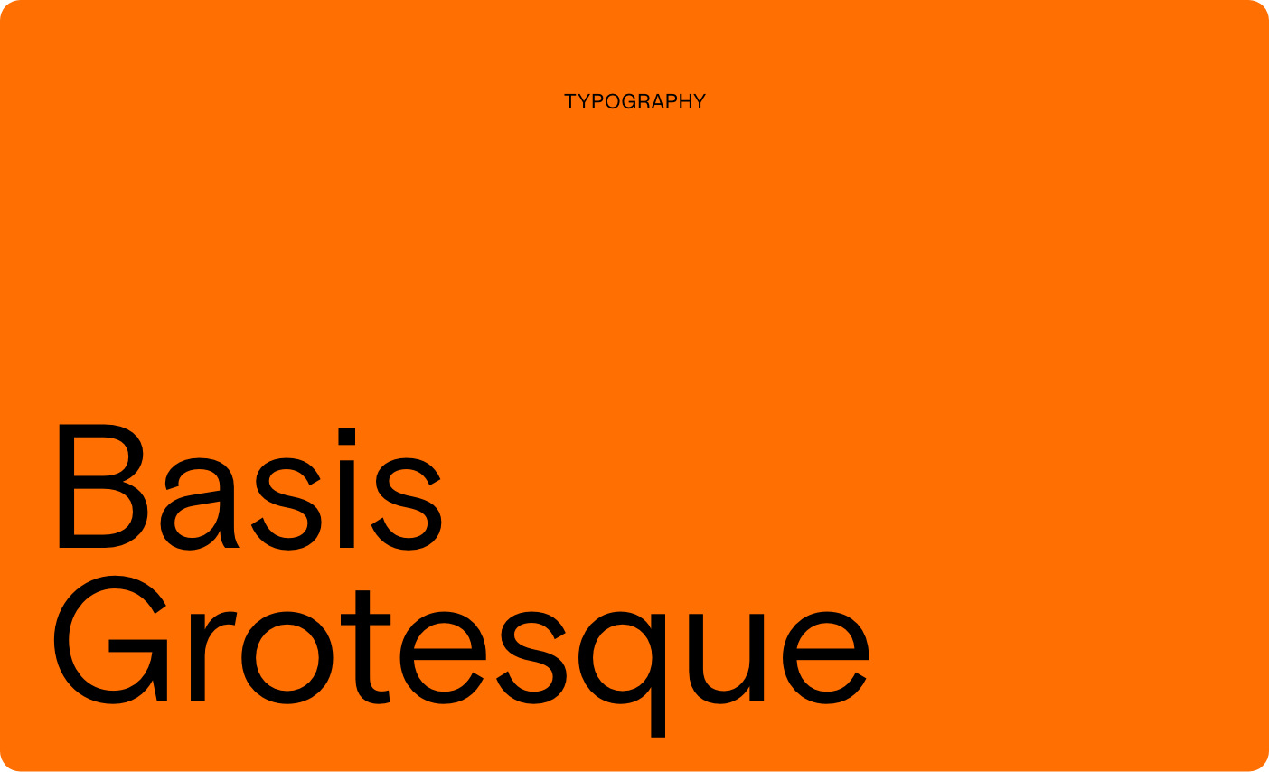
We used the Regular and Medium styles of Basis Grotesque by Colophon Foundry. Being the only typeface used in the new FEST identity, Basis Grotesque makes a bold and confident statement. It promotes recognizability too, serving as a landmark for the brand.

COLOUR PALETTE
The FEST palette consists of a series of daring pops of colors, creating bold combinations.
CATALOGUE
While creating the catalog, we put back the ‘fun’ into functionality with colorful shapes, combined with a striking graphic typography.
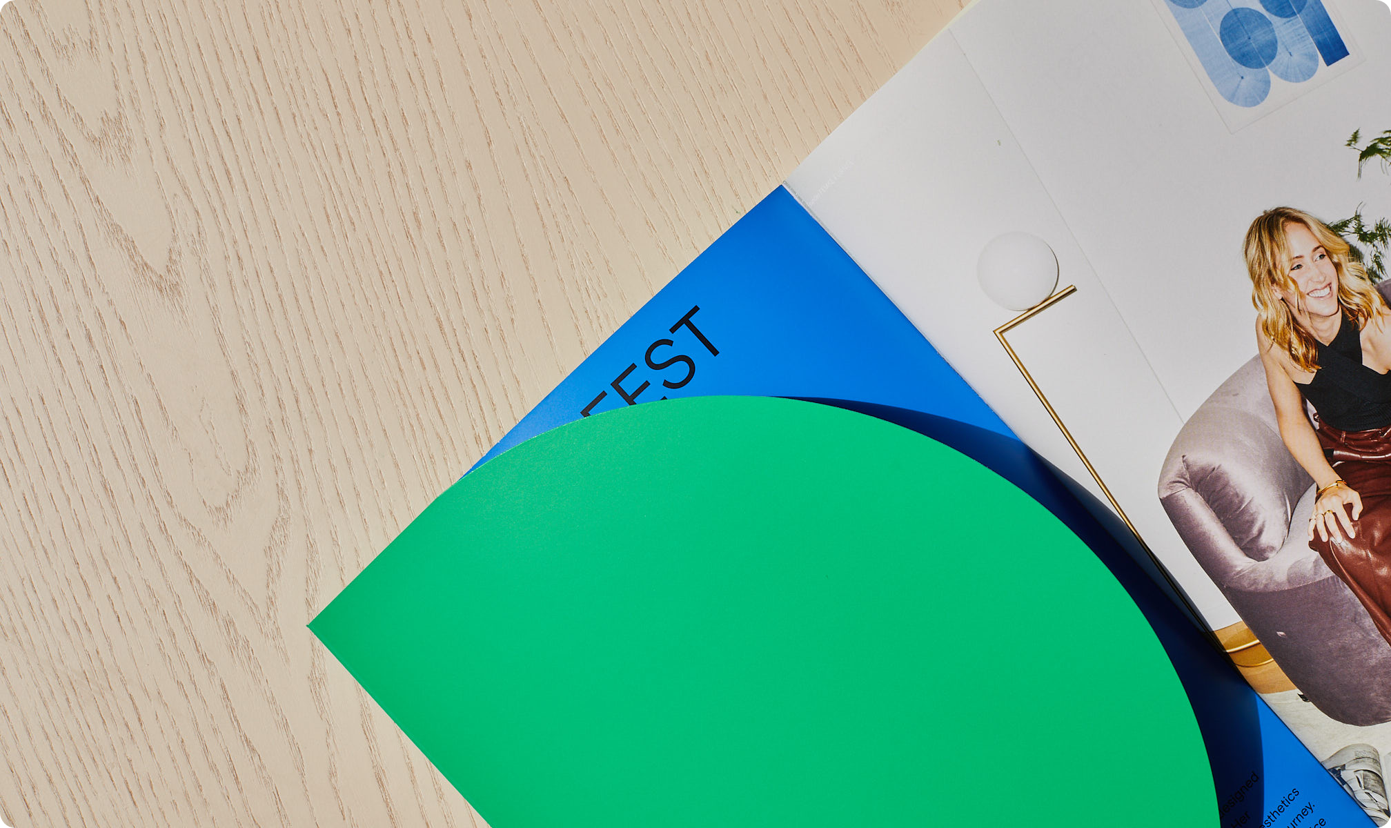
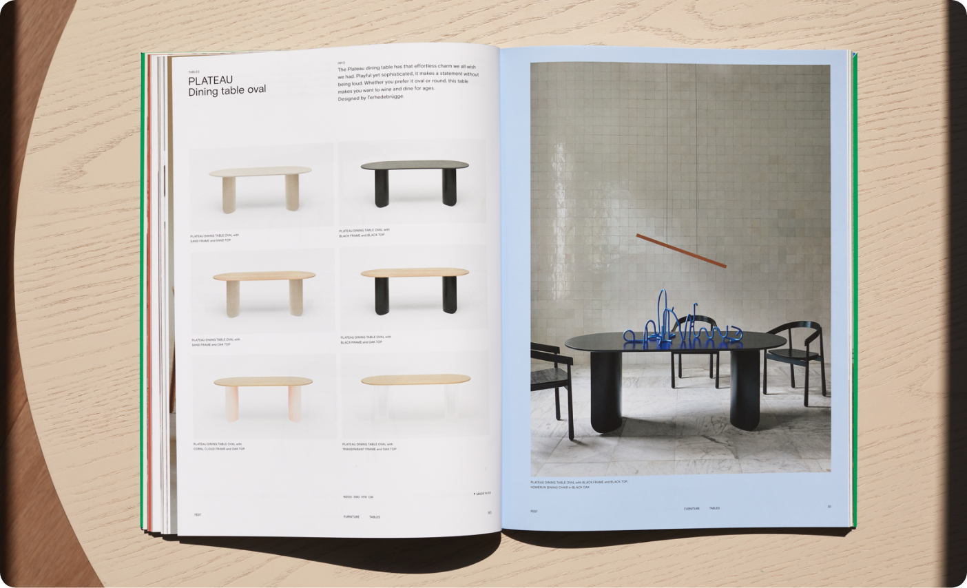

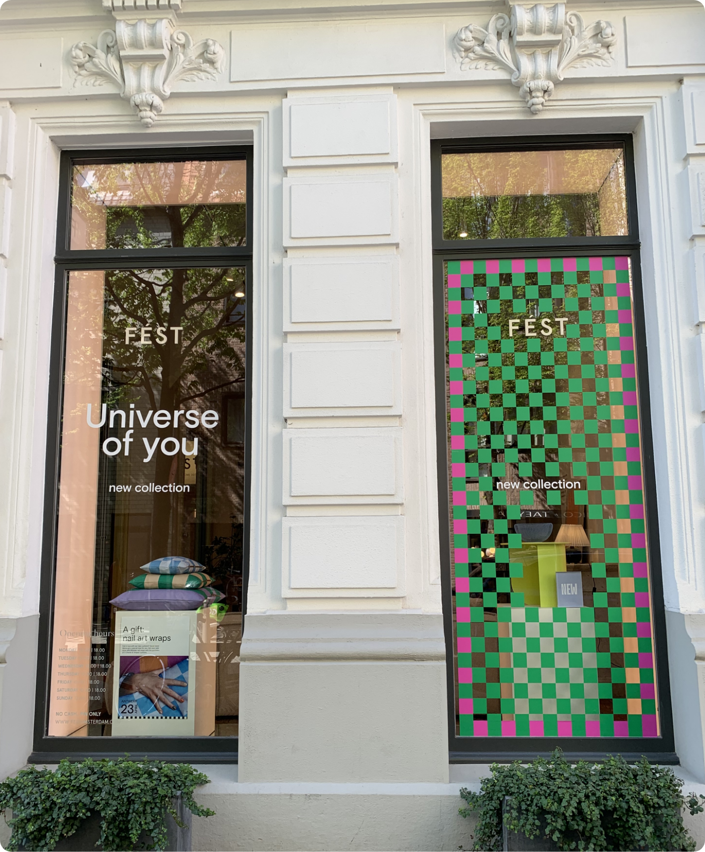
We’re showing FEST’s colorful collection in a graphic, bold and confident way.
WEBSITE
The new FEST website presents a graphic story which fits seamlessly with the brand’s core values. It is clear, inspiring and timeless, yet unmistakably FEST.
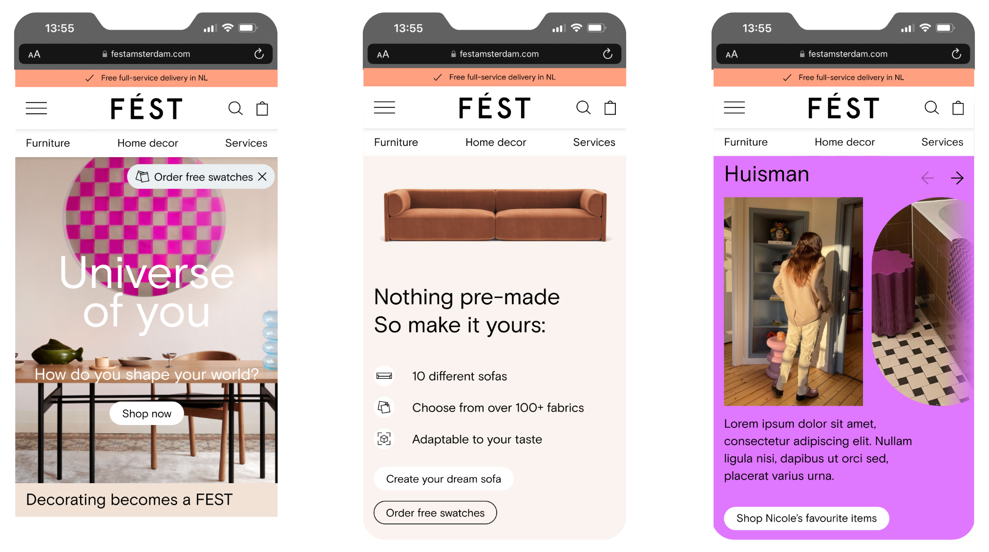
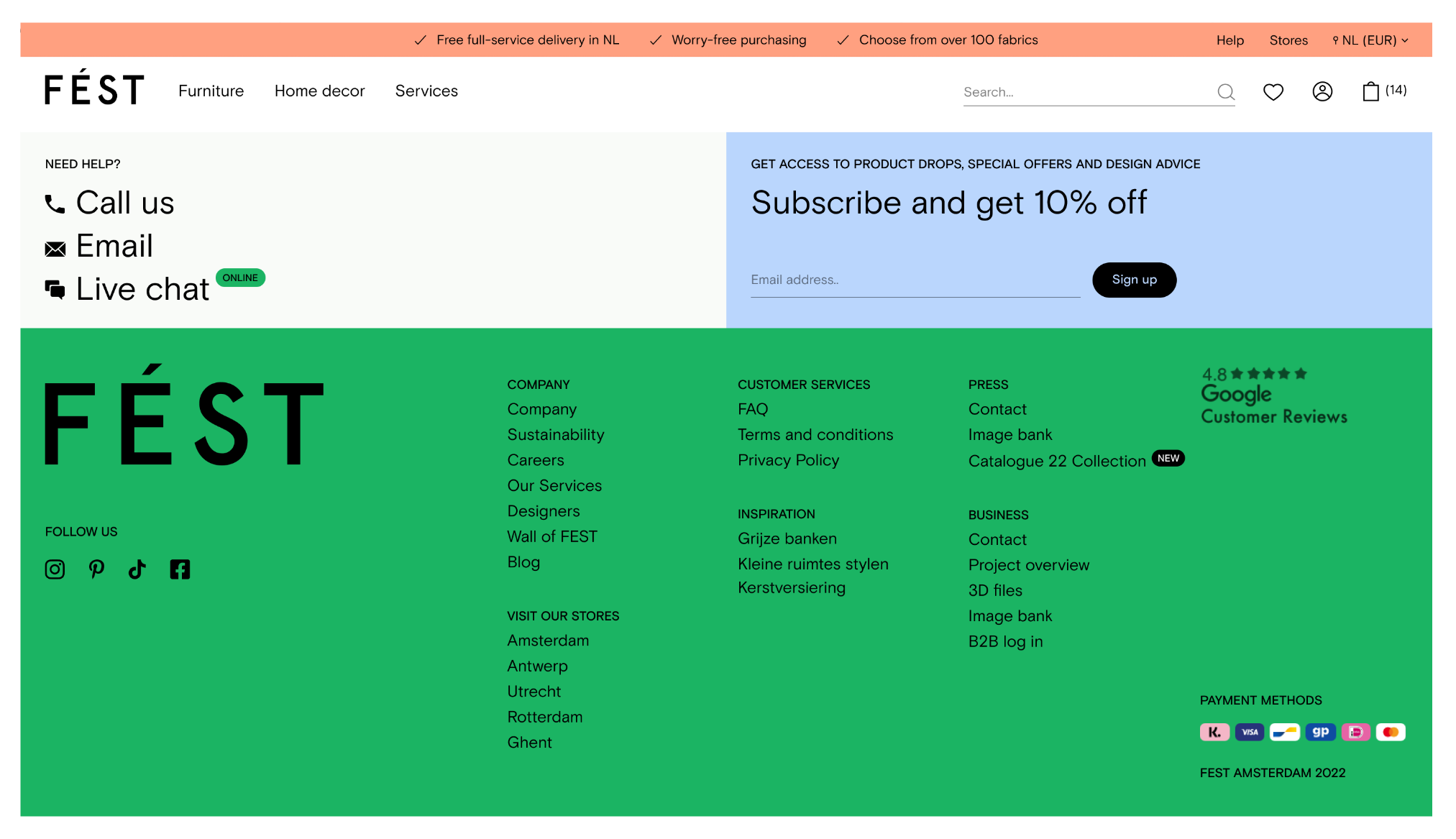
Our primary objective is to significantly improve user engagement through the development of an e-commerce platform that is both intuitive and inspiring.
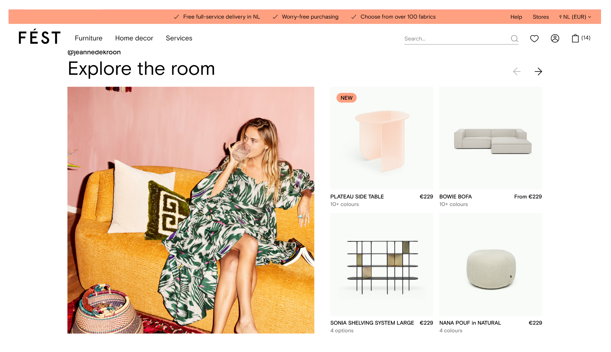
By carefully crafting the user interface and overall design, we strive to create an online shopping experience that captivates and motivates visitors to interact actively with the platform.
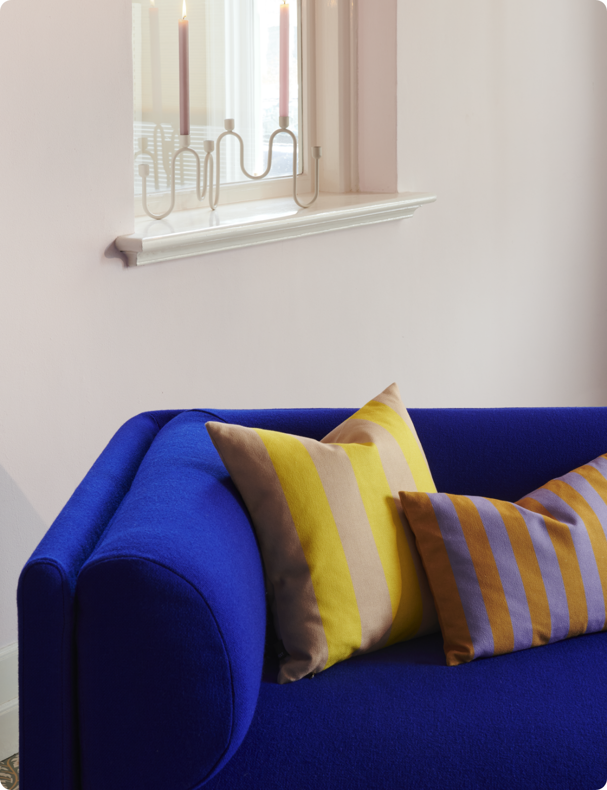
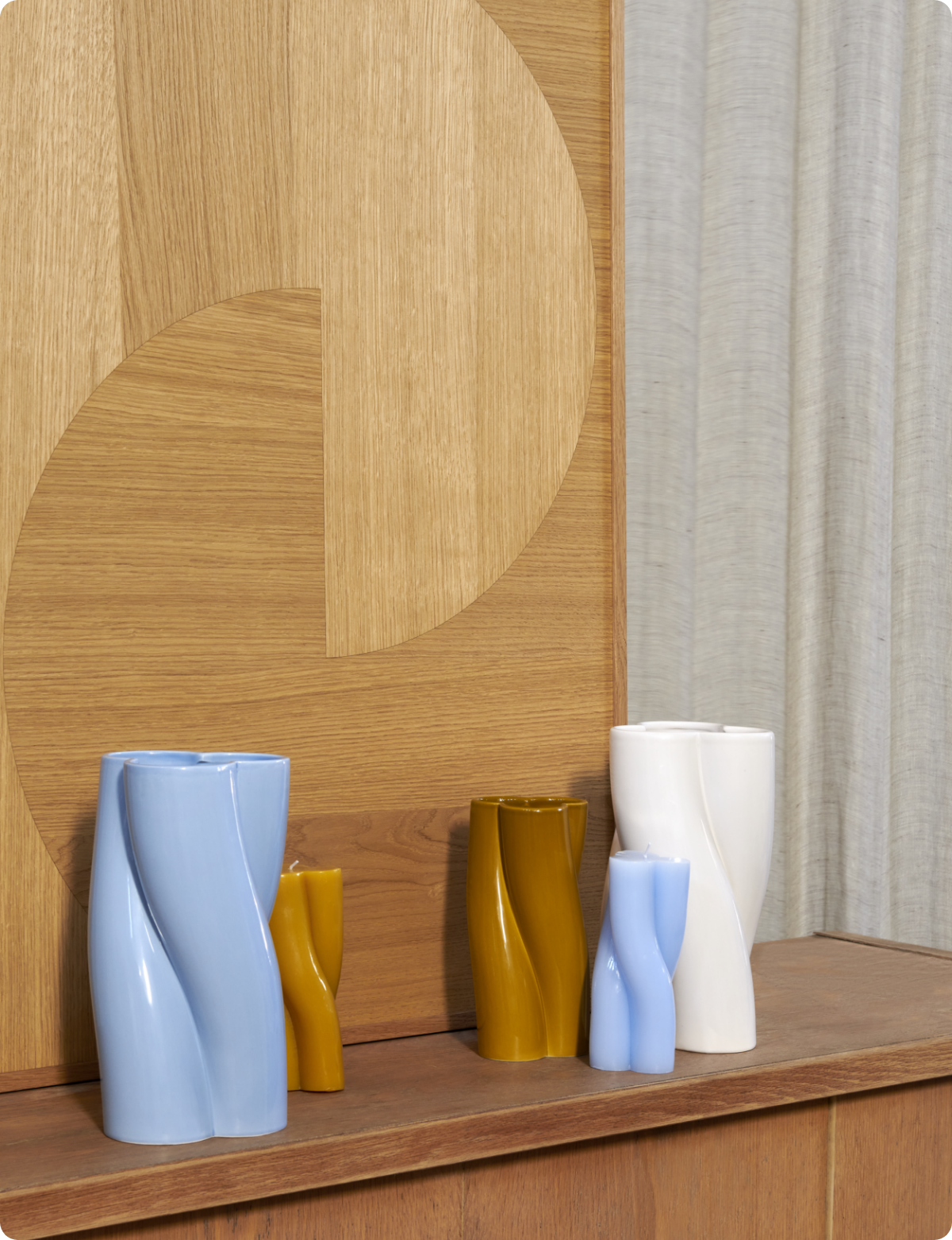
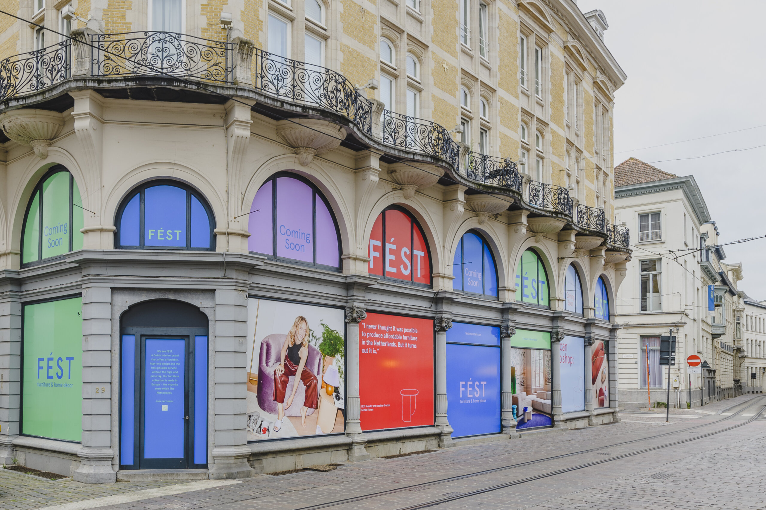
“Phoney is super creative and consistently delivering work that perfectly aligns with our brand's essence, which Phoney helped to pinpoint further. The teams friendly and professional approach makes the collaboration fun and authentic.”
TEDDY VAN DER HEIJDEN
Brand & Campaign Manager, FEST Amsterdam
Every present needs a future. Let's reinvent reality together. Drop us a line
Explore More
Bringing local Dutch nature into your home with Ajen Botanical Body Care
Honoring the past while embracing the future for department store Van Tilburg
Currently working on:
Strategy and branding for a leading interior groupStrategy and branding for a leading interior groupStrategy and branding for a leading interior groupStrategy and branding for a leading interior groupStrategy and branding for a leading interior groupStrategy and branding for a leading interior groupStrategy and branding for a leading interior groupStrategy and branding for a leading interior groupStrategy and branding for a leading interior groupStrategy and branding for a leading interior groupStrategy and branding for a leading interior groupStrategy and branding for a leading interior groupStrategy and branding for a leading interior groupStrategy and branding for a leading interior groupStrategy and branding for a leading interior groupStrategy and branding for a leading interior groupStrategy and branding for a leading interior groupStrategy and branding for a leading interior groupStrategy and branding for a leading interior groupStrategy and branding for a leading interior groupStrategy and branding for a leading interior groupStrategy and branding for a leading interior groupStrategy and branding for a leading interior groupStrategy and branding for a leading interior groupStrategy and branding for a leading interior groupStrategy and branding for a leading interior group
©THE PHONEY CLUB
ALL RIGHTS RESERVED
2023
Currently working on:
Strategy and branding for a leading interior groupStrategy and branding for a leading interior groupStrategy and branding for a leading interior groupStrategy and branding for a leading interior groupStrategy and branding for a leading interior groupStrategy and branding for a leading interior groupStrategy and branding for a leading interior groupStrategy and branding for a leading interior groupStrategy and branding for a leading interior groupStrategy and branding for a leading interior groupStrategy and branding for a leading interior groupStrategy and branding for a leading interior groupStrategy and branding for a leading interior groupStrategy and branding for a leading interior groupStrategy and branding for a leading interior groupStrategy and branding for a leading interior groupStrategy and branding for a leading interior groupStrategy and branding for a leading interior groupStrategy and branding for a leading interior groupStrategy and branding for a leading interior groupStrategy and branding for a leading interior groupStrategy and branding for a leading interior groupStrategy and branding for a leading interior groupStrategy and branding for a leading interior groupStrategy and branding for a leading interior groupStrategy and branding for a leading interior group
