De Zalmhaven
2017 — 2021
De Zalmhaven
2017 — 2021
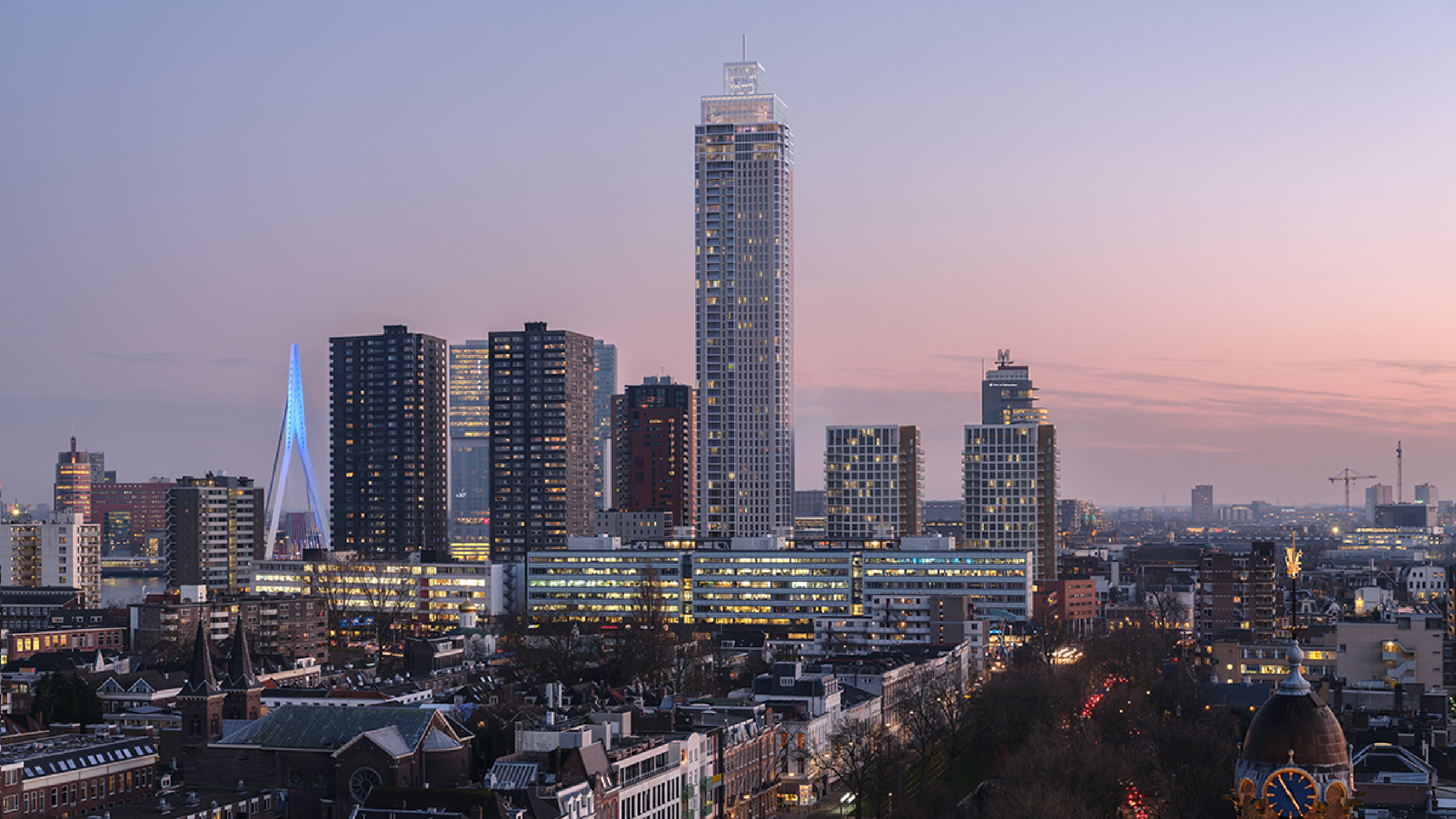
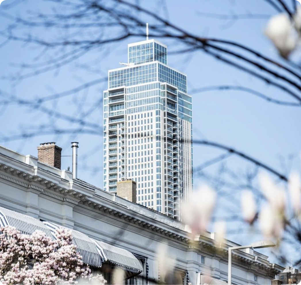
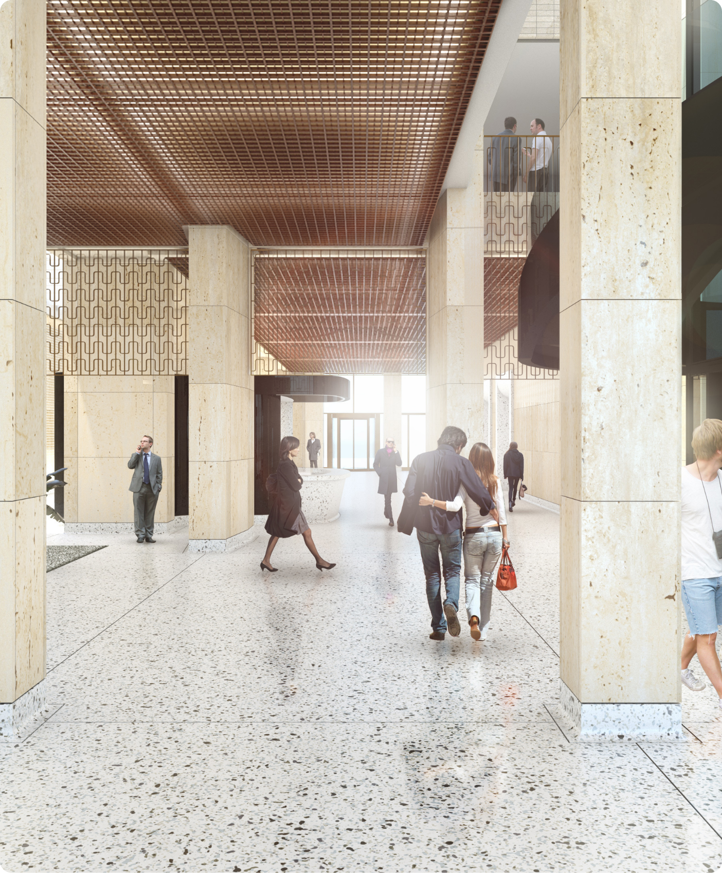
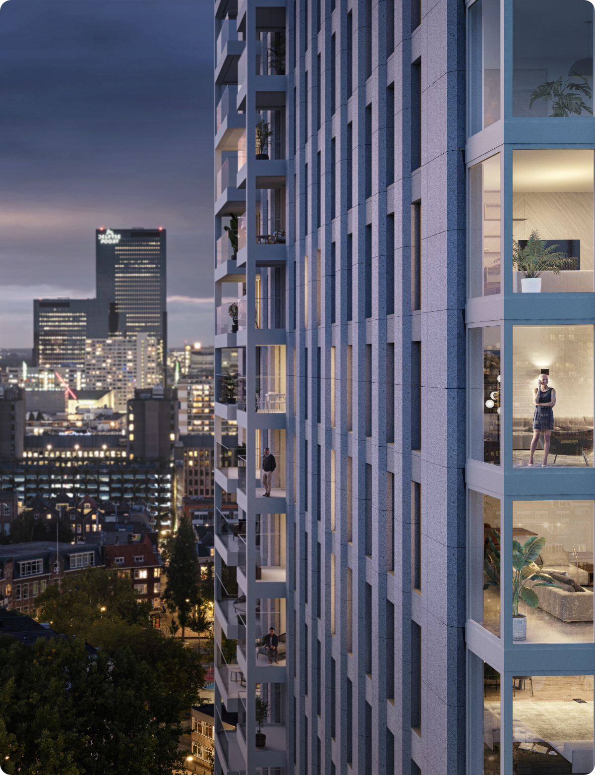
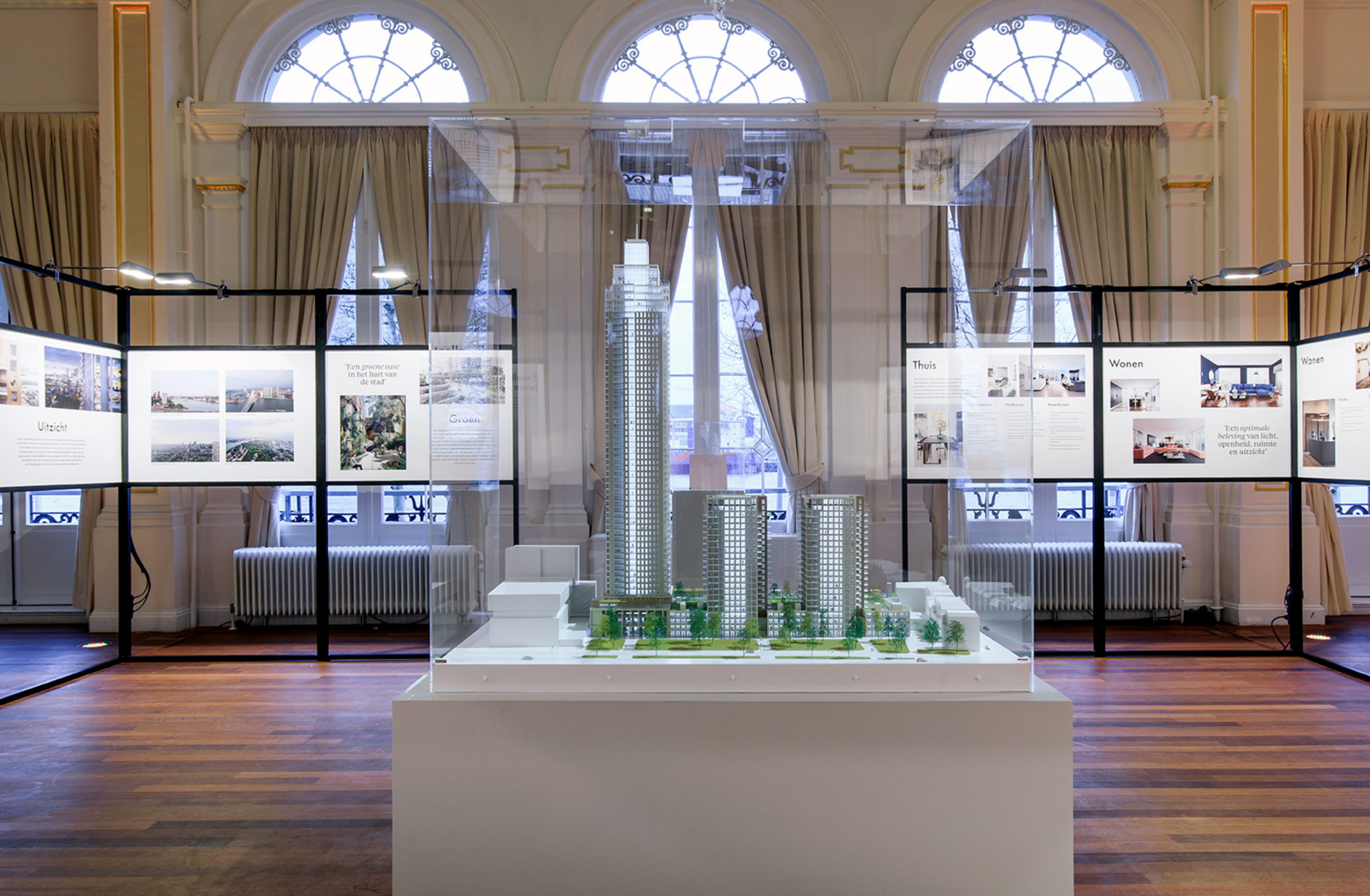
In the heart of Rotterdam's historic Scheepvaartkwartier, a new icon has risen to the city skyline. De Zalmhaven strives to capture the allure of the future on historic ground.
ROLE & SERVICES
Branding
Campaigns
Outlined floor plans
Coffee book
CREDITS
Project in collaboration with Avenue Concordia
Photography:
Rob Glastra
Titia Hahne
CLIENT
Avenue Concordia
Amvest
www.dezalmhaven.com
APPROACH
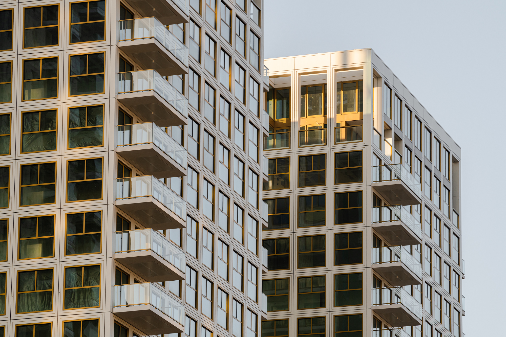
As the tallest building on the Rotterdam skyline, this 215-metre skyscraper stands majestically, its boxed-top overlooking the Maas river and Euromast Park, whilst meeting the famous Erasmusbrug at eye level. We were led on an exciting journey of creating the brand identity, sales campaigns and book designs that would serve as a foundation for all of De Zalmhaven's future communications.
CONCEPT
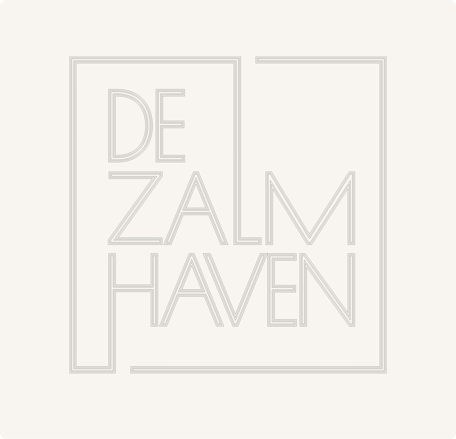
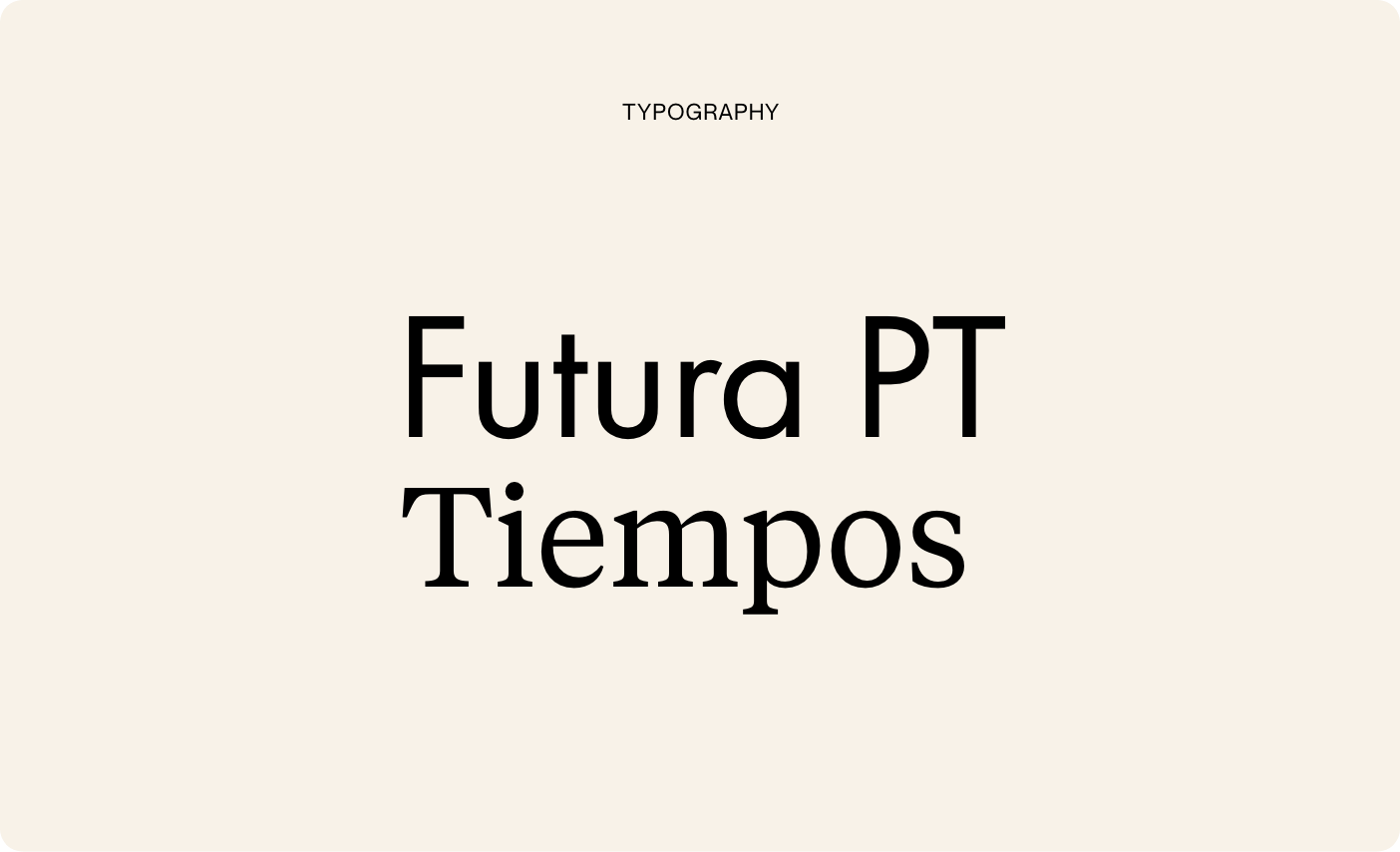
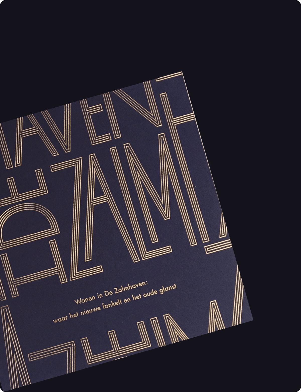
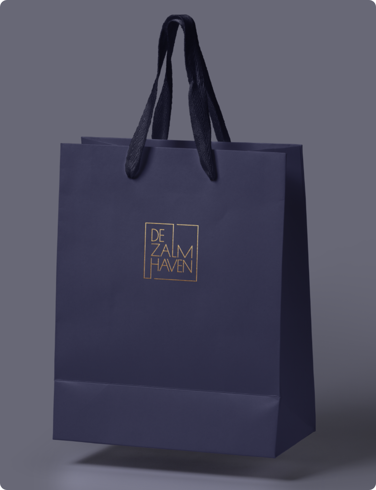
Futureproof living on historical ground, what does that look like? In an attempt to grasp the modern vs. classic duality of the project, we crafted a logo which mirrors the sophisticated architecture of the three residential towers. Our design system, inspired by the building’s slender shapes and vertical lines, has a lightweight and modern feel with a distinct architectural and urban touch.
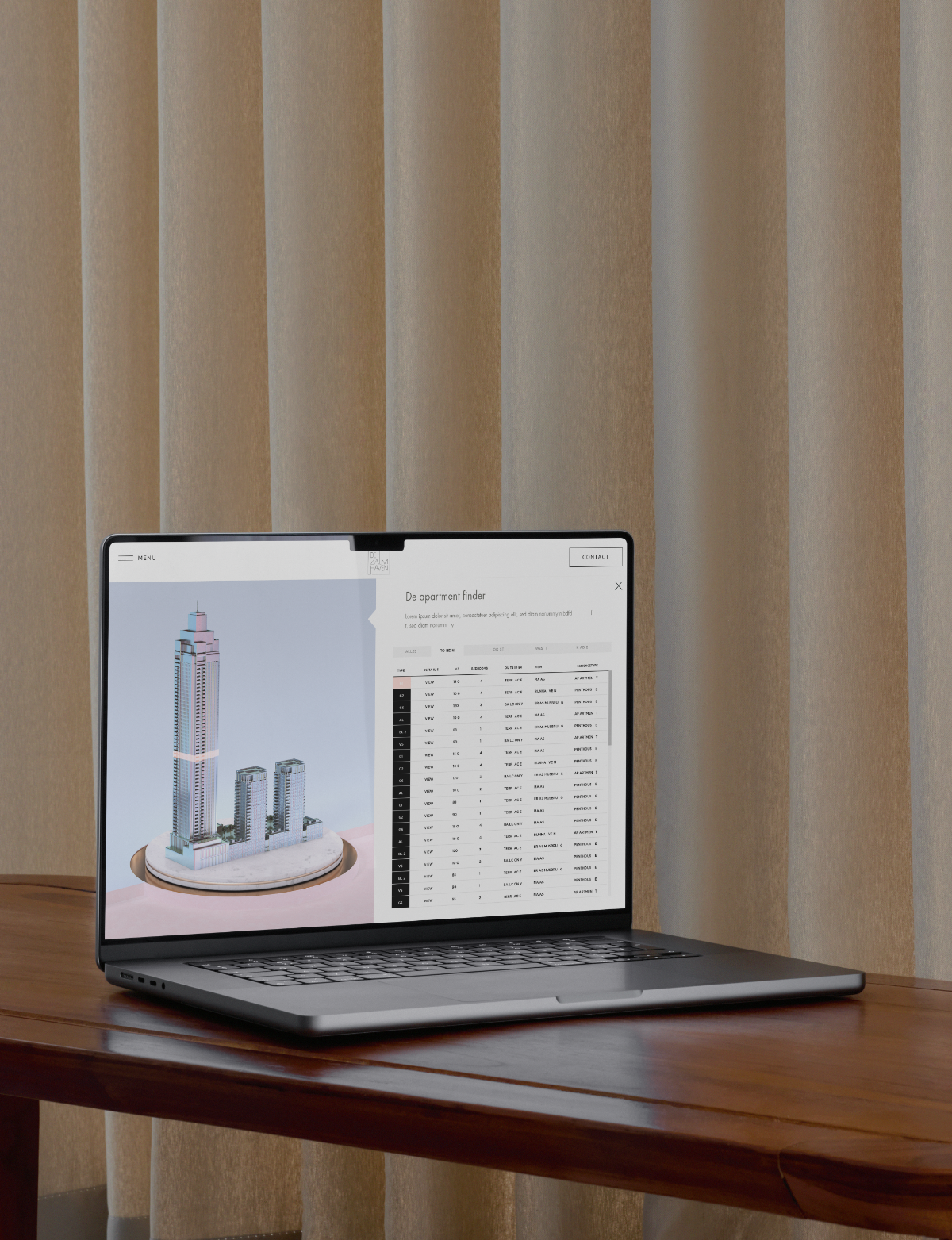
One of our achievements is the development of the apartment finder - a 3D tool enabling users to navigate the available apartments with ease. We translated technical drawings into drawn-to-scale floor plans,
providing potential residents a captivating vision of how life at De Zalmhaven could be furnished.
IDENTITY + COLOURS
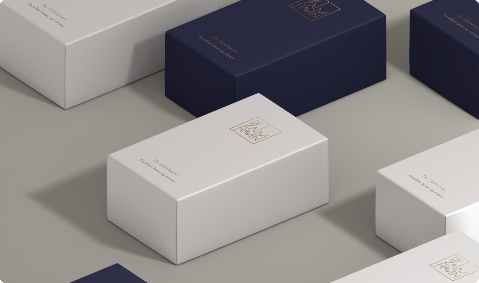
Throughout our five-year partnership, we delved deep into the essence of De Zalmhaven's story, creating a rich visual identity that includes branding, web design, book design, apartment finder, digital and active campaigns and various print expressions. The colour palette, composed of black, white, grey and gold, exudes luxury and depth. Soft greys create visual diversity while gold accents add a touch of luxury.
COFFEE TABLE BOOK
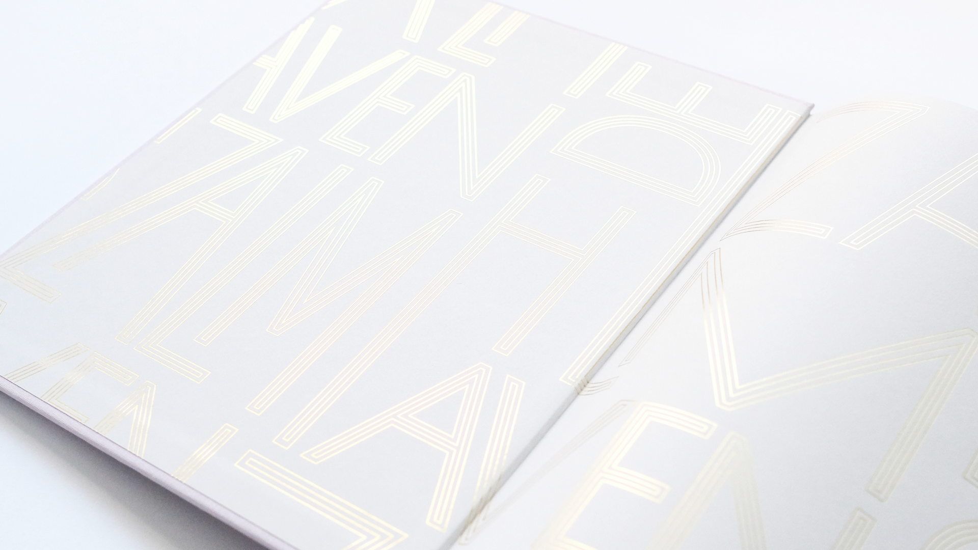
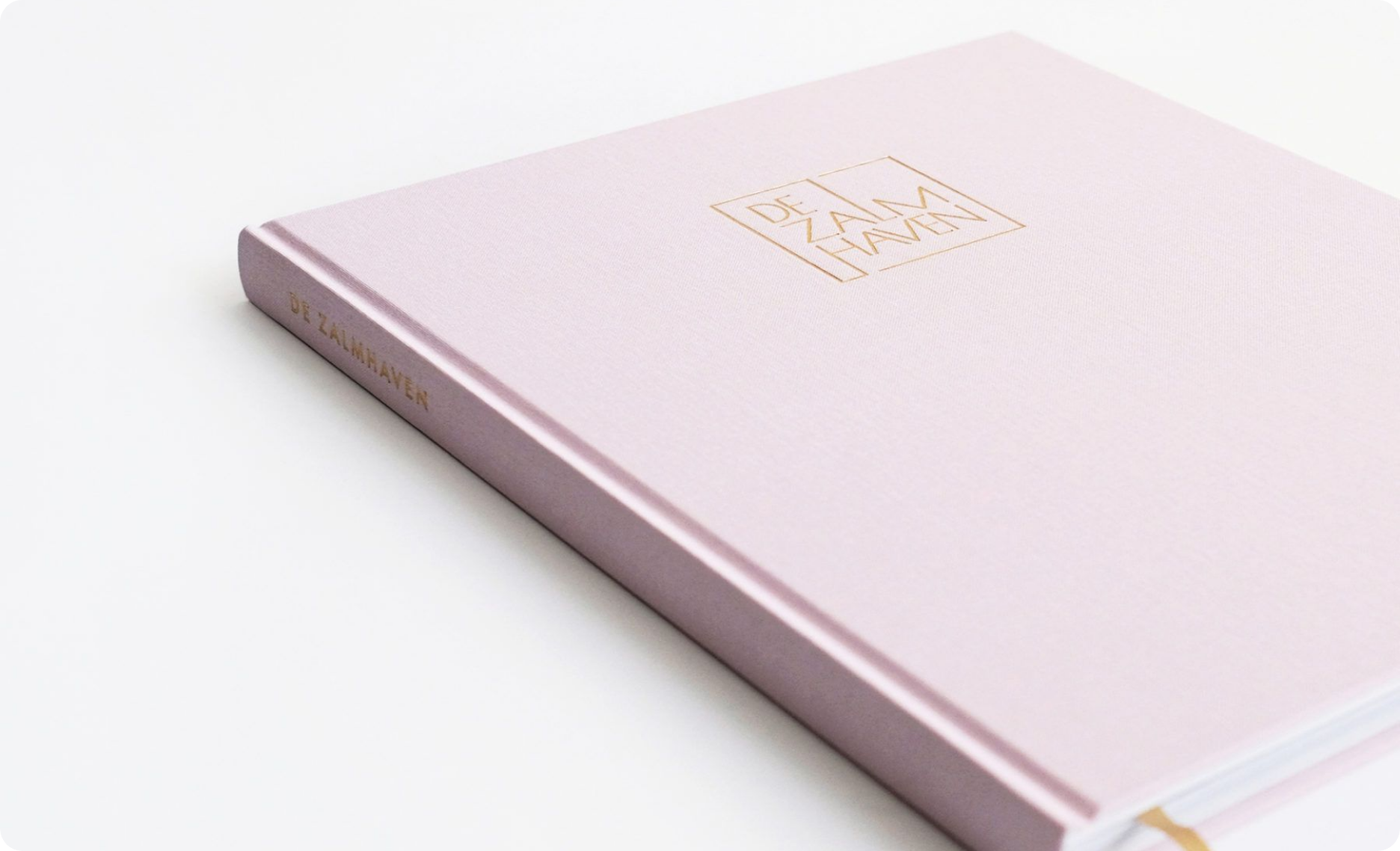
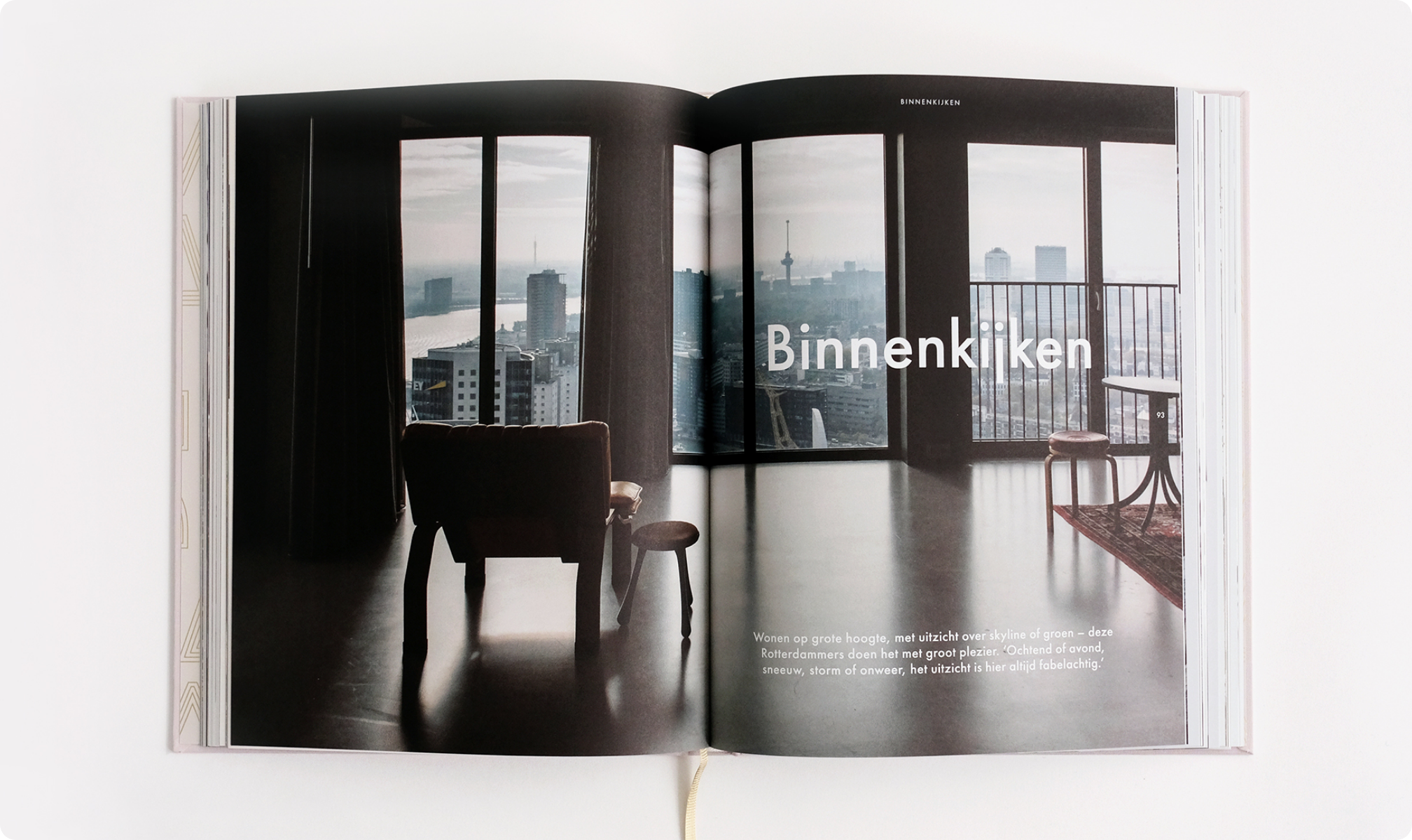
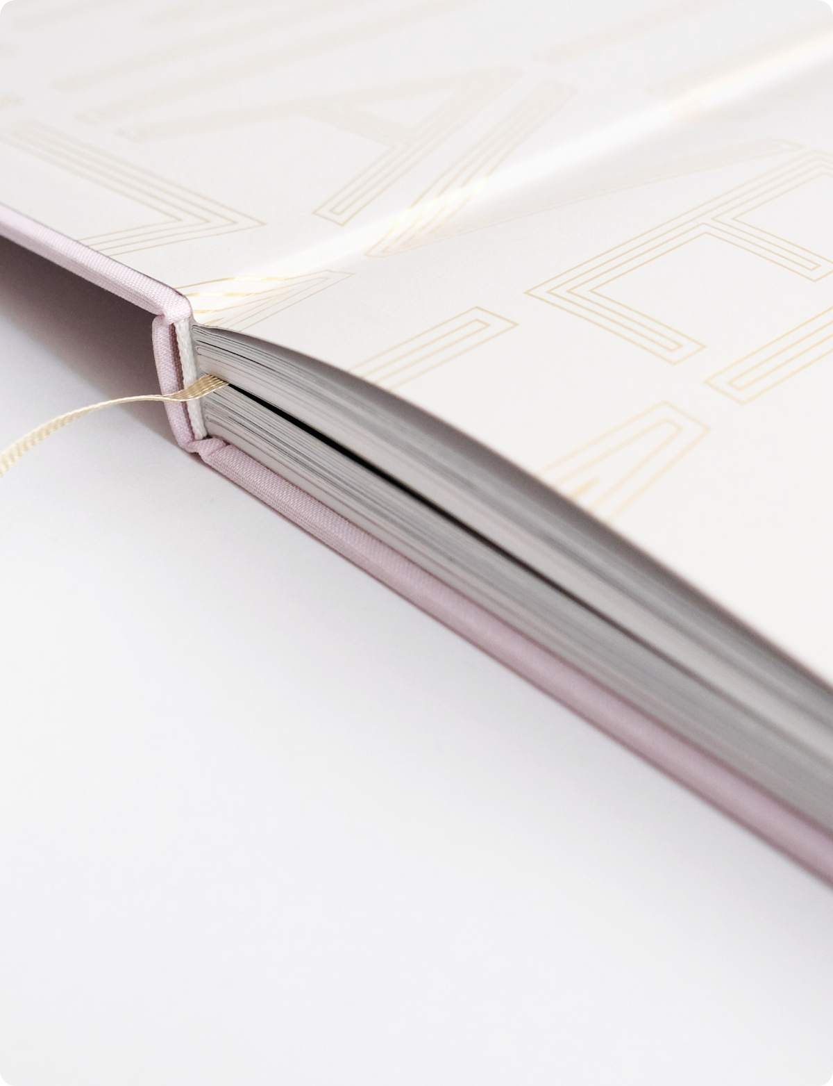
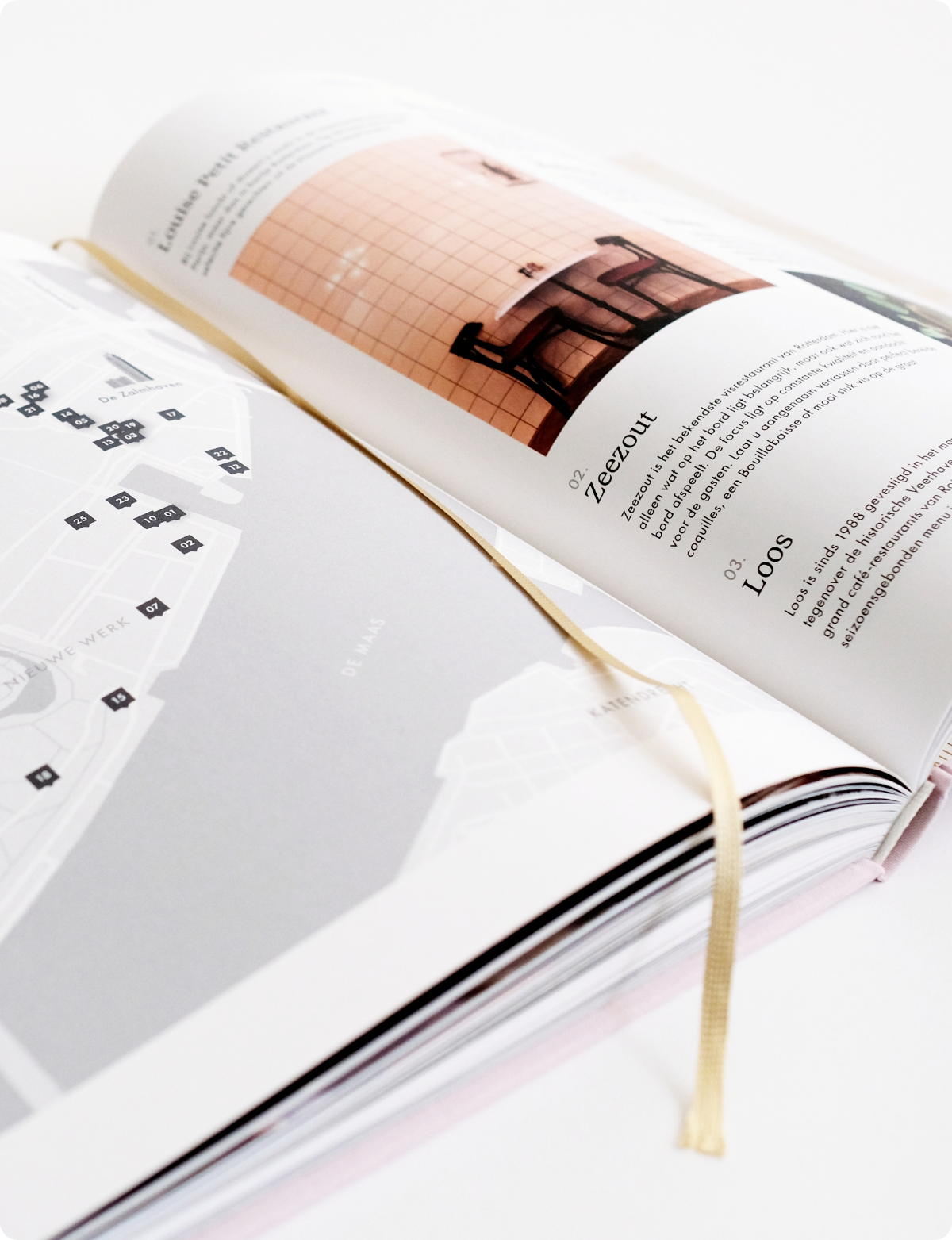
The coffee-table book offers an exclusive look into Rotterdam’s most impressive housing project. Within its 200 pages, the book artfully embodies the essence of luxurious, modern living, inviting readers to experience the comfort and allure of De Zalmhaven’s lifestyle. Bound in linen with opulent golden imprints, the book showcases the architectural excellence and harmonious blend of history and modernity.
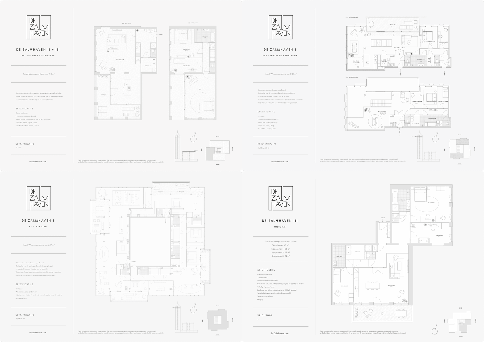
We've drawed floor plans of all the apartments, also furnished, to provide you with a visual representation of the potential layout of your future residence.
Bringing brands to life is our dream. Are you dreaming big? We're just a message away. Connect with us
Explore More
Honoring the past while embracing the future for department store Van Tilburg
Celebrating sport, spirit and women with Laura de Mildt
